mirror of
https://github.com/supabase/supabase.git
synced 2026-09-22 13:37:53 +08:00
master
87 Commits
| Author | SHA1 | Message | Date | |
|---|---|---|---|---|
 Danny White Danny White
|
a31ca2bad0 |
fix(ui): make brand text readable across themes (#49871)
## What kind of change does this PR introduce? Bug fix and design-system update. Resolves DEPR-316. Follow-up rename (`text-brand` → `text-primary`) is in a dedicated PR (https://github.com/supabase/supabase/pull/50564) stacked on this one. ## What is the current behavior? `text-brand` resolves to the canonical bright brand green in places that need readable text, which fails WCAG AA on light surfaces. A separate `text-brand-display` token adds another green for large type. ## What is the new behavior? - `text-brand` maps to accessible `--primary` (light mode darkened to meet ~4.5:1 AA) - `--hue` / `--primary-hue` aligned to 157.5 - `text-brand-display` removed; former display callsites use `text-brand` - Bright fills/borders stay on `brand-default` - Design-system colour and typography docs updated | Before | After | | --- | --- | | <img width="514" height="112" alt="CleanShot 2026-09-02 at 11 13 09@2x" src="https://github.com/user-attachments/assets/4e0138a9-a32d-4e4c-a426-90736706e1e7" /> | <img width="512" height="138" alt="CleanShot 2026-09-21 at 11 42 05@2x" src="https://github.com/user-attachments/assets/164cc5b1-a0c5-4e93-95f1-80016641a114" /> | | <img width="864" height="266" alt="CleanShot 2026-09-02 at 11 13 53@2x" src="https://github.com/user-attachments/assets/3c1ca53f-bf9e-431e-bc15-816b4a275b8e" /> | <img width="882" height="248" alt="CleanShot 2026-09-21 at 11 41 37@2x" src="https://github.com/user-attachments/assets/24828e7b-ed6b-44cb-b9dc-becc3398bdfc" /> | | <img width="782" height="692" alt="CleanShot 2026-09-02 at 11 16 30@2x" src="https://github.com/user-attachments/assets/fc871977-77bc-47fb-9e0e-9284e0ecd5cc" /> | <img width="730" height="690" alt="CleanShot 2026-09-21 at 11 42 52@2x" src="https://github.com/user-attachments/assets/bf479515-d5f9-471e-b82d-f097c0f4b56c" /> | | <img width="480" height="306" alt="CleanShot 2026-09-02 at 11 18 53@2x" src="https://github.com/user-attachments/assets/03f341f4-f02e-44f8-a2b2-8c31670d0427" /> | <img width="470" height="300" alt="CleanShot 2026-09-21 at 11 43 19@2x" src="https://github.com/user-attachments/assets/9df18217-d5e6-48b8-ba0b-579d2664b94b" /> | | <img width="960" height="300" alt="CleanShot 2026-09-02 at 11 32 04@2x" src="https://github.com/user-attachments/assets/6b1d9373-7a71-4247-81ff-26441604b09d" /> | <img width="980" height="306" alt="CleanShot 2026-09-21 at 11 44 13@2x" src="https://github.com/user-attachments/assets/41ad4784-02ec-4b29-b860-32af9fa79aa8" /> | | <img width="924" height="214" alt="CleanShot 2026-09-02 at 11 34 44@2x" src="https://github.com/user-attachments/assets/1de661fe-c7b6-499b-a94f-e4737436ec79" /> | <img width="752" height="162" alt="CleanShot 2026-09-21 at 11 44 56@2x" src="https://github.com/user-attachments/assets/1811890f-0660-4445-84e9-447720954fa1" /> | ## To test Test each callsite **in light mode** (dark mode is largely unchanged). ### WWW - [Homepage](https://zone-www-dot-com-git-dnywh-depr-316-brand-text-tokens-supabase.vercel.app/): “Scale to millions” uses readable brand text (display token is gone) - [Careers](https://zone-www-dot-com-git-dnywh-depr-316-brand-text-tokens-supabase.vercel.app/careers): small “Careers” eyebrow readable; green dividers stay bright `brand-default` - [Contact](https://zone-www-dot-com-git-dnywh-depr-316-brand-text-tokens-supabase.vercel.app/contact-us): email / policy links use readable brand text - [Regions](https://zone-www-dot-com-git-dnywh-depr-316-brand-text-tokens-supabase.vercel.app/regions): “Ask about early access to BYOC” readable ### Docs - [Docs homepage](https://docs-git-dnywh-depr-316-brand-text-tokens-supabase.vercel.app/docs): “DOCS” wordmark and resource links readable - [Database overview](https://docs-git-dnywh-depr-316-brand-text-tokens-supabase.vercel.app/docs/guides/database/overview): nav / footer brand links readable - [JavaScript reference](https://docs-git-dnywh-depr-316-brand-text-tokens-supabase.vercel.app/docs/reference/javascript/introduction): active sidebar treatment readable ### Design system - [Typography](https://design-system-git-dnywh-depr-316-brand-text-tokens-supabase.vercel.app/docs/typography): documents `text-brand` only (no display) - [Colour usage](https://design-system-git-dnywh-depr-316-brand-text-tokens-supabase.vercel.app/docs/color-usage): `text-brand` vs `bg-brand-default` - [Design-system homepage](https://design-system-git-dnywh-depr-316-brand-text-tokens-supabase.vercel.app/): brand text examples across themes ### Studio - [Auth providers](https://studio-staging-git-dnywh-depr-316-brand-text-tokens-supabase.vercel.app/dashboard/project/_/auth/providers): enabled provider badge text readable; status dot stays bright - [Database policies](https://studio-staging-git-dnywh-depr-316-brand-text-tokens-supabase.vercel.app/dashboard/project/_/database/policies?new=true): template hover text more legible - [Database connections](https://studio-staging-git-dnywh-depr-316-brand-text-tokens-supabase.vercel.app/dashboard/project/_/observability/connections): “Live” status readable; animated dot stays bright green --------- Co-authored-by: Joshen Lim <joshenlimek@gmail.com> |
||
|
Gildas Garcia
|
3669fef749 |
Fix tooltip a11y comment (#50640)
## Problem The tooltip comment we have about removing the `aria-describedby` attribute to avoid screen readers reading the same text twice is wrong. ## Solution Make it clear why we do that so that future devs don't remove it. <!-- This is an auto-generated comment: release notes by coderabbit.ai --> ## Summary by CodeRabbit * **Accessibility** * Clarified accessibility guidance for tooltips and screen-reader labels across code blocks, database controls, function editors, hooks, and table actions. * **Documentation** * Updated internal comments to more clearly explain why duplicate tooltip text is avoided for screen readers. <!-- end of auto-generated comment: release notes by coderabbit.ai --> |
||
|
Nik Richers
|
e3c677fc5a |
feat(docs): track prompt panel copies in PostHog (#50482)
## I have read the [CONTRIBUTING.md](https://github.com/supabase/supabase/blob/master/CONTRIBUTING.md) file. YES ## What kind of change does this PR introduce? Add telemetry for `PromptPanel` to help us understand how people interact with our AI prompts better. Relates to DOCS-1393 Dashboard(restricted access): [Docs: AI prompt affordances](https://eu.posthog.com/project/34344/dashboard/957235) ## What is the current behavior? The docs homepage cover renders a setup panel with "AI Prompt" and "CLI" tabs, and guides render `AiPrompt` blocks. Both are built on the shared `PromptPanel`, whose copy button called `copyToClipboard` and nothing else. Copying was therefore unmeasured, while the neighbouring affordances (`ask_ai_clicked`, `agent_setup_clicked`, `copy_as_markdown_clicked`) are already instrumented. ## What is the new behavior? `PromptPanel` takes an optional `telemetry` prop. When it is set, the panel sends a new docs-owned event after a **successful** clipboard write, so instrumentation lives in the shared component instead of a forked homepage copy button. New event in `packages/common/telemetry-constants.ts`: | | | | --- | --- | | `action` | `docs_ai_prompt_copied` | | `source` | `homepage` \| `guide` \| `agent_setup` | | `tab` | `prompt` \| `cli` (omitted for panes outside that set) | | `promptId` | prompt id, when the panel comes from an `AiPrompt` block | Wired consumers: `HomePageCover` (`homepage`), `AiPrompt` (`guide` by default, plus `promptId`), and `AgentSetup` (`agent_setup`). No prompt body text and no PII is sent. Studio's existing `ai_prompt_copied` event is deliberately left alone: it has a different owner and surface, and merging the two would blend unrelated funnels. ### Proof it works ``` $ pnpm run test:local:unwatch features/ui/PromptPanel.telemetry.test.ts RUN v5.0.0 /apps/docs Test Files 1 passed (1) Tests 4 passed (4) Duration 775ms ``` ## Additional context Test plan, run against a local docs server with a stub telemetry endpoint so the request bodies could be read directly: | Case | Observed payload | | --- | --- | | Homepage, AI Prompt tab | `{"source":"homepage","tab":"prompt"}` | | Homepage, CLI tab | `{"source":"homepage","tab":"cli"}` | | Next.js quickstart `AiPrompt` | `{"source":"guide","tab":"prompt","promptId":"nextjs"}` | | `automate-with-agents/health` `AgentSetup` | `{"source":"agent_setup","tab":"prompt","promptId":"monitoring-agent-health"}` | | Clipboard write rejected | no request sent, error toast shown, button does not flip to "copied" | The failure case was re-checked with a control click on the same page after restoring a working clipboard, which did send the event, so the negative result is not just a missed handler. Also run: `turbo typecheck --filter=docs --filter=common` (passes), Prettier check on the touched files (passes), and ESLint on the touched docs files (no new findings; the one warning on `HomePageCover` is the pre-existing default export). <!-- This is an auto-generated comment: release notes by coderabbit.ai --> ## Summary by CodeRabbit * **New Features** * Successful prompt copies are now tracked across the homepage, documentation guides, and agent setup experiences. * Copy activity records the prompt’s source, selected format, and associated prompt when available, providing more complete usage insights. <!-- end of auto-generated comment: release notes by coderabbit.ai --> --------- Co-authored-by: Nik Richers <nik@validmind.ai> |
||
|
Anthony Lio
|
5918a69398 |
feat(docs): agent prompt block (#50565)
## What kind of change does this PR introduce? docs ui polish for the prompt panel on the docs homepage and in the quickstarts ## What is the current behavior? agent prompt renders as one run on paragraph steps read as "1. ... 2. ... 3. ..." inline making it hard to read ## What is the new behavior? - sets prompt bodies as markdown for easier readability - adds long prompts collapse - removes panel tab icons - uses panel code block ui - makes active tab has an underline on first paint `home` | state | preview | | -------|------| | before | <img width="709" height="344" alt="image" src="https://github.com/user-attachments/assets/ba3a0948-efff-4144-8eba-9065e1f140d9" /> | | after | <img width="709" height="344" alt="image" src="https://github.com/user-attachments/assets/e63e71e9-86d2-4d9a-ac2d-925e197d69f9" /> | `quickstart` | state | preview | | -------|------| | before | <img width="862" height="344" alt="image" src="https://github.com/user-attachments/assets/96faf012-a9f1-4ee9-8a98-3ec6de24d2de" /> | | after | <img width="862" height="344" alt="image" src="https://github.com/user-attachments/assets/7a41a259-e181-4a32-949f-de095d8bb66c" /> | <!-- This is an auto-generated comment: release notes by coderabbit.ai --> ## Summary by CodeRabbit * **New Features** * Prompts now support Markdown formatting, inline code chips, expandable content, and improved hover-reveal behavior. * Code-copy controls support customizable labels and clearer screen-reader announcements. * Prompt tabs and panels have updated styling, spacing, and active-content handling. * **UI Improvements** * Setup and agent prompts now use consistent Markdown-rendered presentation. * Prompt headings now display “Agent Prompt.” * Home page setup code blocks use a more compact layout. <!-- end of auto-generated comment: release notes by coderabbit.ai --> |
||
|
Anthony Lio
|
7fb2e8cd42 |
fix(docs): repeated shiki grammar registration (#50501)
## What kind of change does this PR introduce? bug fix alternative to #50492 ## What is the current behavior? [#50239](https://github.com/supabase/supabase/pull/50239) introduced repeated shiki grammar registration. duplicate injection rules accumulate between code blocks, slowing later tutorials enough to hit the 60-second build timeout ## What is the new behavior? - reuses one highlighter with all languages loaded once - restores previous highlighting approach + startup cost while keeping the page-size savings replay | before #50239 | after #50239 | this pr -- | -- | -- | -- cold, including initialization | 2.99 s | 6.96 s | 2.94 s warm | 0.37 s | 5.90 s | 0.36 s <!-- This is an auto-generated comment: release notes by coderabbit.ai --> ## Summary by CodeRabbit ## Enhancements * Code blocks now preload syntax highlighting for all supported bundled languages, including SQL, Markdown, and TypeScript. * Highlighting uses a shared configuration and theme for consistent rendering across code blocks. * Concurrent code block renders share a single highlighter initialization. * Language handling and syntax-highlighted output are more consistent across supported, unsupported, aliased, and plain-text code blocks. <!-- end of auto-generated comment: release notes by coderabbit.ai --> --------- Co-authored-by: Ali Waseem <waseema393@gmail.com> |
||
|
Anthony Lio
|
38f448b01c |
fix(ui): tab component (#50183)
## What kind of change does this PR introduce? bug fix on tab component + a small refactor ## What is the current behavior? the active tab in an underline list gets border-b-2 while its siblings get nothing, so it's 2px taller and its label sits higher than the rest causing a smol layout shift within docs ## What is the new behavior? - adds one absolute positioned bar that slides between tabs so nothing moves - favors track under an underline as an inset shadow vs a border | state | preview | | -------|------| | before | <video src="https://github.com/user-attachments/assets/b73820a6-2994-46d1-aa98-452681f0fef2" /> | | after | <video src="https://github.com/user-attachments/assets/054cd67d-a50c-4aef-9340-a1e1d515047b" /> | ## Test 1. visit [api reference](https://docs-git-antlio-ui-components-tabs-supabase.vercel.app/docs/reference/javascript/installing?platform=npm&queryGroups=platform) 2. visit a [guide ](https://docs-git-antlio-ui-components-tabs-supabase.vercel.app/docs/guides/database/prisma) <!-- This is an auto-generated comment: release notes by coderabbit.ai --> ## Summary by CodeRabbit - **New Features** - Added an animated tab indicator that follows the active tab and adapts to layout changes. - Added support for customizing tab indicator styling. - Respects reduced-motion preferences by disabling indicator transitions when appropriate. - **Style** - Streamlined tab borders, spacing, and underlined-tab styling. - Improved tab panel spacing and standardized tab behavior in documentation examples. - Centralized easing behavior for smoother overlays, dropdowns, slides, and panels. <!-- end of auto-generated comment: release notes by coderabbit.ai --> --------- Co-authored-by: Danny White <3104761+dnywh@users.noreply.github.com> |
||
|
Anthony Lio
|
6d08a747f1 |
fix(docs): guide reference perf enhancements (#50239)
## What kind of change does this PR introduce? follow-up to #50235 to reduce reference page payloads and cold rendering overhead ## What is the current behavior? reference pages ship a large rsc payload inside the html _ most of it is duplication rather than content along with shiki that writes ~30 character css variable name for every syntax token making the page heavy in some cases ## What is the new behavior? - moves repeated styles into shared css and uses compact, namespaced token classes - renders details icons inside the client trigger - follows shiki’s guidance to [reuse one highlighter](https://shiki.style/guide/best-performance#cache-the-highlighter-instance) and [load languages on demand](https://shiki.style/guide/best-performance#use-shorthands) `page size` page | before | after | change -- | -- | -- | -- javascript | 10.61 mb | 8.28 mb | -21.9% dart | 4.59 mb | 4.13 mb | -10.1% python | 4.38 mb | 3.73 mb | -14.9% swift | 2.87 mb | 2.56 mb | -10.9% server | 1.59 mb | 1.35 mb | -15.2% kotlin | 3.42 mb | 3.17 mb | -7.2% `cold initialization` language | before | after | reduction -- | -- | -- | -- bash | 2,180 ms | 23 ms | 98.95% javascript | 2,245 ms | 38 ms | 98.29% ## Additional context measured on a local production build which uses the checked in generated content _ production has larger sdk data, so absolute sizes there will be higher <!-- This is an auto-generated comment: release notes by coderabbit.ai --> ## Summary by CodeRabbit * **New Features** * Added reusable expand/collapse controls for API reference details, with updated icons, labels, and styling. * Improved code block rendering with class-based syntax highlighting, wrapped-code support, responsive layouts, and lazy language loading. * **Style** * Added theme-aware syntax-token colors, line-number styling, and configurable code-block shadows. * Consolidated expandable reference panel and item styling. * **Tests** * Added coverage for syntax highlighting, code block rendering, language support, token stability, and reference details. <!-- end of auto-generated comment: release notes by coderabbit.ai --> |
||
|
Anthony Lio
|
42f1401769 |
fix(ui-patterns): a11y accessible names for ExpandableVideo (#50226)
## What kind of change does this PR introduce? bug fix a11y `ExapndableVideo` ## What is the current behavior? `ExpandableVideo` blurred thumbnail has `alt="Video guide preview"` sitting behind an overlay that already reads "Watch video guide" making screen readers announcing the same thing twice ## What is the new behavior? - adds an optional `videoTitle` prop that names the video once and feeds both the button's `aria-label` and the player's `title`. ## Test 1. visit `/docs/guides/functions` <!-- This is an auto-generated comment: release notes by coderabbit.ai --> ## Summary by CodeRabbit - **Enhancements** - Video previews in guides now display the relevant guide title. - Partner introduction videos now include a descriptive title. - Video controls and embedded players provide more specific accessibility labels when titles are available. - Preview images without meaningful alternative text are treated as decorative to reduce redundant screen-reader output. - **Bug Fixes** - Guide titles with Markdown formatting now appear as clean, readable text in video labels. <!-- end of auto-generated comment: release notes by coderabbit.ai --> |
||
|
Anthony Lio
|
71d652483e |
fix(docs): youtube iframe lack titles (#50225)
## What kind of change does this PR introduce? a11y bug fix on youtube embed ## What is the current behavior? YouTube iframes across guide pages have no `title` attribute, so screen readers announce them as an unnamed frame ## What is the new behavior? - extracts a `YouTube.tsx` ui component - adds `<YouTube id title />` + `title` as a required prop ## Test 1. visit `/docs/guides/ai/examples/openai` <!-- This is an auto-generated comment: release notes by coderabbit.ai --> ## Summary by CodeRabbit - **Documentation** - Standardized embedded YouTube videos across guides with a consistent video player. - Added descriptive titles to improve accessibility and clarity. - Preserved existing video content and playback behavior. - Updated video embeds across AI, authentication, database, functions, realtime, self-hosting, storage, and migration documentation. - **New Features** - Added privacy-enhanced YouTube playback for embedded documentation videos. <!-- end of auto-generated comment: release notes by coderabbit.ai --> |
||
|
Danny White
|
476d4a5851 |
refactor(ui): drop redundant Button variant="default" props (#50161)
## What kind of change does this PR introduce? Mechanical cleanup on top of the Button default-variant change (#50160). ## What is the current behavior? Many callsites still pass `variant="default"` even though that is now the component default. ## What is the new behavior? Removes redundant static `variant="default"` from legacy `Button` and `ButtonTooltip` callsites. Keeps explicit defaults where they document the API: - `button-default.tsx` and `button-sizes.tsx` demos - `DocsButton`, which pins neutral styling at the wrapper boundary ## To test Studio: - [Auth → Rate Limits](https://studio-staging-2s957kwc4-supabase.vercel.app/dashboard/project/_/auth/rate-limits): dirty the form so Cancel appears; Cancel stays neutral, Save stays green - [Project Settings → API Keys](https://studio-staging-2s957kwc4-supabase.vercel.app/dashboard/project/_/settings/api-keys): `DocsButton` in the header actions stays neutral Design system: - [Design system → Button](https://design-system-git-dnywh-dc924ac1-supabase.vercel.app/design-system/docs/components/button): `button-default` / `button-sizes` still show explicit default styling; Primary (green) is restricted to the Primary section (and `asChild`) WWW: - [www → Brand assets](https://zone-www-dot-com-git-dnywh-dc924ac1-supabase.vercel.app/brand-assets): Download logo kit / Download button kit stay neutral |
||
|
Jordi Enric
|
f3bd8ee7e3 | fix(docs): reduce reference page response size (#50235) | ||
|
Anthony Lio
|
e6bd407e88 |
fix(docs): collapsible details component (#50065)
## What kind of change does this PR introduce? nitpick ui bug fix in docs of the collapsible details component + commentary ## What is the current behavior? 1. data / response / notes collapsibles on reference pages grow taller when you expand them + also get double padding: the panel pads the content, and the code block pads itself again inside it 2. commentary that follows a snippet in the example column renders unstyled, since that column has no prose context. it comes out larger than the description column and inline code stays as plain text ## What is the new behavior? ├ adds `CodeBlock` a `compact` variant that get appropriate styling when used within collapsible | state | preview | | -------|------| | before | <video src="https://github.com/user-attachments/assets/8b70e1c6-9e0e-4371-a2b2-eb4a3d580247" /> | | after | <video src="https://github.com/user-attachments/assets/1e5cdd46-ce7d-4d2d-ac6a-6da680df37e5" /> | ├ wraps example column in prose so trailing commentary matches the description font size + inline code styling | state | preview | | -------|------| | before | <img width="1142" height="404" alt="image" src="https://github.com/user-attachments/assets/8d0f1ac0-087d-47f7-b35d-b8798d589fdb" /> | | after | <img width="1142" height="404" alt="image" src="https://github.com/user-attachments/assets/b9ba4202-a8dd-407d-b535-f34d83f5b24b" /> | ## Test - visits `/docs/reference/javascript/using-filters-gt` - visits `/docs/reference/server/middleware-withsupabaseadminclient` <!-- This is an auto-generated comment: release notes by coderabbit.ai --> ## Summary by CodeRabbit - **New Features** - Documentation code blocks can now be displayed in a compact format without borders or extra spacing. - Reference documentation supports customizing code block presentation. - **Style** - Improved formatting for example content, including prose wrapping, spacing, and code block margins. - Refined collapsible documentation sections with clearer spacing, hover and focus states, and open/close animations. - Code-only collapsible content now uses a more compact layout, while text content receives consistent typography and padding. <!-- end of auto-generated comment: release notes by coderabbit.ai --> |
||
|
Anthony Lio
|
84d3ce1bd2 |
fix(docs): keep code block line numbers sticky while scrolling (#49962)
## What kind of change does this PR introduce? bug fix + some ui polish on the docs code block ## What is the current behavior? line numbers scroll away with the code _ so you lose your place in any block wide enough to scroll _ the gutter is also see-through so scrolled code renders interleaved with the numbers ## What is the new behavior? - makes gutter sticky and stays pinned while the code scrolls (no rubber) - fixes gutter, row hover, and button backgrounds as opaque so nothing bleeds through - adds gutter right edge fades vs bg - adds right padding so line endings clear the buttons - adds press feedback on the shared in-house `Button` gated behind `motion-safe` | state | preview | | -------|------| | before | <img width="566" height="263" alt="image" src="https://github.com/user-attachments/assets/81778815-1f15-4ea5-a647-ed48418210e8" /> | | after | <img width="566" height="259" alt="image" src="https://github.com/user-attachments/assets/b7d770c5-4156-491f-93c8-b0d900b7dc85" /> | <!-- This is an auto-generated comment: release notes by coderabbit.ai --> ## Summary by CodeRabbit * **UI Improvements** * Refined code block controls with consistent styling, active states, animated icons, and automatic copy-status reset. * Improved code block line-number presentation with hover effects, sticky gutters, spacing, shadows, and smoother horizontal scrolling. * Added smoother button transitions and a subtle pressed-state animation. * Respect reduced-motion preferences by disabling icon animations when requested. <!-- end of auto-generated comment: release notes by coderabbit.ai --> |
||
|
Pedro Rodrigues
|
16046a0139 |
docs: add omp (oh-my-pi) to supported clients in MCP and plugin guides (#50045)
## What this does

Adds **omp** (oh-my-pi) across the Supabase AI-tools docs.

- **Plugin docs** (`AgentPluginsPanel`) — omp client + Anthropic
marketplace install: `omp plugin marketplace add
anthropics/claude-plugins-official`, then `omp plugin install
supabase@claude-plugins-official`.
- **MCP docs** (`McpUrlBuilder`) — omp under "AI Agent CLI":
`.omp/mcp.json` / `~/.omp/agent/mcp.json` (JSON), `/mcp add` guided
setup, project vs user scope.
- **"Pick your agent" grid** — add the omp logo and tagline ("A coding
agent with the IDE wired in.").

No CLI command mapping entry — omp has no `omp mcp …` subcommand, so the
page documents file-based setup (`/mcp add` wizard or direct JSON edit).
Matches other file-configured clients like kiro.

## Testing

Verified against omp 18.1.11: written `.omp/mcp.json` parsed by runtime,
`/mcp list` shows server connected; `omp plugin marketplace add/install
supabase@claude-plugins-official` works; `omp plugin list` confirms
installed.

## Preview

### Agent Plugin page

<img width="1128" height="706" alt="image"
src="https://github.com/user-attachments/assets/1f06895b-2d45-4b64-b9ab-c1670201c370"
/>


### MCP page

<img width="1128" height="706" alt="image"
src="https://github.com/user-attachments/assets/30a9a823-0e78-4c3b-aeeb-3a6a7aa40ed6"
/>


### AI Tools main page

<img width="1128" height="706" alt="image"
src="https://github.com/user-attachments/assets/064a3234-9f4d-4f0a-9598-fbb2a465266f"
/>


Closes AI-1184

<!-- This is an auto-generated comment: release notes by coderabbit.ai
-->

## Summary by CodeRabbit

- **New Features**
- Added OMP as a supported AI coding agent across documentation and
integrations.
- Added OMP installation guidance, including marketplace setup, scope
options, session reloads, and authentication.
  - Added support for configuring the Supabase MCP server through OMP.
- Added OMP branding, icon, tagline, repository, and documentation
links.

<!-- end of auto-generated comment: release notes by coderabbit.ai -->
|
||
|
Anthony Lio
|
085d218bff |
fix(docs): button a11y enhancements (#49952)
## What kind of change does this PR introduce? bug fix for accessibility, fixes [docs-1265](https://linear.app/supabase/issue/DOCS-1365/add-aria-label-to-icon-only-buttons-button-name) ## What is the current behavior? some controles in the docs app have no accessible name, so screen readers announce them as an unlabelled "button" ## What is the new behavior? - adds each control a name the way its neighbours already do - adds menu toggle a state-dependent `aria-label` and `aria-expanded` - adds `button-name` to `enforced_rules` <!-- This is an auto-generated comment: release notes by coderabbit.ai --> ## Summary by CodeRabbit - **Accessibility** - Added descriptive labels to configuration selectors and mobile menu controls. - Mobile menu controls now announce whether the menu is open or closed. - Expanded accessibility validation to check button names across documentation pages. - **UI Improvements** - Updated the raw throughput table control with a clearer button appearance and expandable chevron indicator. - Replaced a schema-migration tooltip with a direct in-page link. - **Documentation** - Removed the Info Tooltip component guidance from the contributing documentation. <!-- end of auto-generated comment: release notes by coderabbit.ai --> |
||
|
Saxon Fletcher
|
36d2982af4 |
docs: add reusable monitoring agent setup components (#49506)
<!-- CURSOR_AGENT_PR_BODY_BEGIN --> ## Stack Draft stack extracted from `docs/monitoring`. Merge bottom-up. Troubleshooting / debugging-guide rewrite is out of scope. 1. #49503 move inspect and advisors 2. #49501 split Studio logs from ClickHouse queries 3. #49500 treat reports as signal dashboards 4. #49502 add Observe the data hub 5. **#49506** add agent setup components ← **this PR** 6. #49504 add hire-an-agent templates 7. #49505 restructure observability nav and overview ## I have read the [CONTRIBUTING.md](https://github.com/supabase/supabase/blob/master/CONTRIBUTING.md) file. YES ## What kind of change does this PR introduce? Docs app feature (MDX components + markdown export). Fifth layer in the observability stack. ## What is the current behavior? There is no shared way to render a monitoring agent prompt, schedule, and Claude/Codex/Cursor setup instructions in both HTML and generated markdown. ## What is the new behavior? - `AgentSetup` and `AgentWatchSchedule` MDX components, registered for HTML and markdown export - Shared `monitoring-agents` data (cadence, prompt ids, harness steps) - Opt-in `AiPrompt` markdown export (`includeInMarkdown`) so quickstarts stay HTML-only - Optional content-listing `subtitle` for schedule labels on cards No agent guide pages yet — those land in #49504 so this PR stays a reviewable code change. ## Additional context Markdown schema handlers share the same data module as the React components. <!-- CURSOR_AGENT_PR_BODY_END --> <div><a href="https://cursor.com/agents/bc-a3cb5ece-925b-4046-b58a-5d69e9a9d794?cursor_ref=pr_footer&cursor_cta=open_in_web"><picture><source media="(prefers-color-scheme: dark)" srcset="https://cursor.com/assets/images/open-in-web-dark.png"><source media="(prefers-color-scheme: light)" srcset="https://cursor.com/assets/images/open-in-web-light.png"><img alt="Open in Web" width="114" height="28" src="https://cursor.com/assets/images/open-in-web-dark.png"></picture></a> <a href="https://cursor.com/background-agent?bcId=bc-a3cb5ece-925b-4046-b58a-5d69e9a9d794&cursor_ref=pr_footer&cursor_cta=open_in_cursor"><picture><source media="(prefers-color-scheme: dark)" srcset="https://cursor.com/assets/images/open-in-cursor-dark.png"><source media="(prefers-color-scheme: light)" srcset="https://cursor.com/assets/images/open-in-cursor-light.png"><img alt="Open in Cursor" width="131" height="28" src="https://cursor.com/assets/images/open-in-cursor-dark.png"></picture></a> </div> --------- Co-authored-by: Cursor Agent <cursoragent@cursor.com> Co-authored-by: Saxon Fletcher <SaxonF@users.noreply.github.com> |
||
|
Anthony Lio
|
27a4421d6e |
fix(docs): stop sidebar from jumping on scroll (#49807)
## What kind of change does this PR introduce? bug fix to stop sidebar jump on scroll within docs ## What is the current behavior? the docs sidebar shifts up by 1px as soon as scrolling start as the top bar height include bottom border causing the jump as height token differ from the whole height ## What is the new behavior? favor box shadow instead of a border for the bottom line, so height matches the token and nothing needs to compensate any more which allows to remove some `+1px` elsewhere + also drops a nested `lg:sticky` in the sidebar that did nothing inside an already-sticky parent | state | preview | | -------|------| | before | <video src="https://github.com/user-attachments/assets/b4bbfa2d-6595-4711-bb2b-bd2bf3aded8a" /> | | after | <video src="https://github.com/user-attachments/assets/f044aebc-ef14-42c1-8564-3b290399d00b" /> | ## Additional context - header now uses the existing `subhighlight-border` utility, which was not used anywhere else it seems, could also be renamed? - could be down the other way by keeping border and fixing the jump <!-- This is an auto-generated comment: release notes by coderabbit.ai --> ## Summary by CodeRabbit * **Bug Fixes** * Improved documentation navigation alignment by removing unnecessary spacing from sticky sidebars, table of contents, and section headings. * Updated desktop navigation behavior for more consistent scrolling and viewport layout. * Refined the top navigation bar’s border styling for a cleaner appearance. <!-- end of auto-generated comment: release notes by coderabbit.ai --> |
||
|
Miranda Limonczenko
|
f09d35cfd5 |
fix(docs): make code blocks reachable and readable by keyboard and screen reader (#49562)
Closes DOCS-1283 https://github.com/user-attachments/assets/6e55a27f-6f73-453b-b98f-e91d3c14a9e4 ## Problem Three defects in the docs code block: - The scroll container has no `tabindex`. On `/guides/database/tables`, 18 blocks, none focusable, 2 overflowing at 1280px. Tab skips the scroll region, so a keyboard-only user cannot scroll code that runs off the edge. - The container has `role="group"` with no accessible name, so it announces as bare "group". - The line-number gutter has no `aria-hidden`, so digits are read inline with the code. A block linearizes as `1import { createClient } from '@supabase/supabase-js'23const supabase = ...`, with lines 2 and 3 collapsing into "23". Four more surfaced while testing the fix: - The wrap and copy buttons were absolutely positioned inside the element that scrolls, so `right-2` measured against the scrollable content box. Scrolling dragged them out of the corner into the middle of the code. This one predates the PR. - The buttons preceded the code in the DOM, so a screen reader read two actions before naming what they act on. - `focus-within` only fired for the buttons, so focusing the block left the controls invisible. - Both buttons set an `aria-label` identical to their tooltip text, and Radix points `aria-describedby` at the tooltip on focus, producing "Copy code, button, Copy code". ## Solution Keyboard: - Split the scroll region out of the positioning container, so the controls stay pinned. - Give the scroll region a `tabIndex` and a focus ring. - Reveal the controls on `group-focus-within`. Screen reader: - Name the region `<language>, <n> lines`. Code content stays readable; the summary goes in the name so the group can be skipped or stepped into. - Map fence aliases to spoken names, so `ts` announces as TypeScript. Only the ambiguous ones; `bash`, `python`, `kotlin`, `dart`, `swift` already read fine. - `aria-hidden` the gutter. The numbers are already `select-none`, and copy takes its content from the source string rather than the DOM, so copy behavior is unchanged. - Order the controls after the code. - Announce the word wrap toggle through a live region, matching the copy button. - Opt both buttons out of Radix's generated description. Also moved the `data-wrapped` side effect out of the `setIsWrapped` updater, since React calls updaters twice under StrictMode. ## Manual testing 1. Open `/docs/guides/database/tables`. 2. Run `document.querySelectorAll('.code-scroll[tabindex="0"]').length` in the console. Expect `18`. 3. Run `[...document.querySelectorAll('.code-scroll')].map(b => b.getAttribute('aria-label'))`. Expect entries like `SQL, 11 lines` and `bash, 2 lines`, plus one bare `2 lines` for the fence with no language. 4. Tab to a code block. Expect a visible focus ring, and the wrap and copy buttons to appear. 5. Press ArrowRight on the block under "Basic data loading", which overflows. Expect it to scroll, and the buttons to stay in the top-right corner. 6. Press Enter on the wrap button. Expect the code to wrap and a screen reader to announce "Word wrap enabled". 7. With VoiceOver on, focus a code block. Expect "SQL, 11 lines, code block", then the code read without line numbers interleaved. Focus each button and expect its name once, not twice. <!-- This is an auto-generated comment: release notes by coderabbit.ai --> ## Summary by CodeRabbit - **Accessibility** - Improved code block labels for screen readers, including programming language and line count. - Added announcements when word wrap is enabled or disabled. - Enhanced keyboard focus behavior for code block controls. - **Usability** - Kept code block controls visible while scrolling through code. - Improved wrapped-code overflow handling. - Removed redundant tooltip descriptions for copy and word-wrap controls. <!-- end of auto-generated comment: release notes by coderabbit.ai --> |
||
|
Miranda Limonczenko
|
bb094f96c8 |
docs(mcp): revise authentication note to match style guide (#49219)
<img width="769" height="212" alt="Screenshot 2026-08-18 at 12 17 18 PM" src="https://github.com/user-attachments/assets/38ce6606-84ae-4833-a7d9-7a1931fdd773" /> ## I have read the [CONTRIBUTING.md](https://github.com/supabase/supabase/blob/master/CONTRIBUTING.md) file. YES ## What kind of change does this PR introduce? Docs update. Copy and dedupe. ## What is the current behavior? Gave this a style edit. Basically, saw this note breaking a lot of style rules at once (`login` instead of `log in`, future tense, and also breaking timelessness) and couldn't help myself for submitting a revision. 😅 ## What is the new behavior? Preview: https://docs-git-cursor-revise-mcp-auth-note-bbe8-supabase.vercel.app/docs/guides/ai-tools/mcp --------- Co-authored-by: Cursor Agent <cursoragent@cursor.com> Co-authored-by: Miranda Limonczenko <czenko@users.noreply.github.com> |
||
|
Pedro Rodrigues
|
d3146a1755 |
docs: add Grok plugin and MCP install instructions (#49212)
## What this does Adds **Grok** (Grok Build) across the Supabase AI-tools docs, and fixes two logo gaps. - **Plugin docs** (`AgentPluginsPanel`) — Grok client + `grok plugin install …` / in-session `/plugins` steps. - **MCP docs** (`McpUrlBuilder`) — Grok under "AI Agent CLI": `~/.grok/config.toml` (`[mcp_servers.supabase]`), `grok mcp add … --transport http`, OAuth steps. - **"Pick your agent" grid** — add the Grok logo, and fix **Warp**'s pre-existing missing logo (both were absent from the grid's `ICON_ASSETS` map). - **Fix**: the plugins-page Cursor entry was missing `hasDistinctDarkIcon`, so its dark-mode logo fell back to the light mark — aligned with the MCP list. - Adds Grok + Warp agent logos (light + dark). ## Testing Verified against grok `1.0.5`: `grok plugin install …` works; the generated `config.toml` and `grok mcp add` command are both parsed by `grok mcp list`. Pairs with supabase-community/supabase-plugin#45 (the `.grok-plugin` surface); merge after that lands. ## Preview [Agent Plugin page](https://docs-git-pedrorodrigues-ai-932-add-grok-agent-p-12402b-supabase.vercel.app/docs/guides/ai-tools/plugins#manual-installation) <img width="877" height="378" alt="image" src="https://github.com/user-attachments/assets/8fd9e112-5c11-412b-bd8c-611912043e6d" /> [MCP page](https://docs-git-pedrorodrigues-ai-932-add-grok-agent-p-12402b-supabase.vercel.app/docs/guides/ai-tools/mcp#remote-mcp-installation) <img width="877" height="513" alt="image" src="https://github.com/user-attachments/assets/459de070-5049-433a-929f-9902222e157d" /> [AI Tools main page](https://docs-git-pedrorodrigues-ai-932-add-grok-agent-p-12402b-supabase.vercel.app/docs/guides/ai-tools#pick-your-agent) <img width="877" height="642" alt="image" src="https://github.com/user-attachments/assets/e6ca40d2-e9c9-466c-a837-dbda4bdc09f7" /> Closes AI-932, AI-974 <!-- This is an auto-generated comment: release notes by coderabbit.ai --> ## Summary by CodeRabbit ## New Features - Added Grok as a supported AI tool and MCP client. - Added Grok installation instructions, CLI setup, authentication, and connection verification guidance. - Added Grok icons for light and dark themes. - Added support for custom documentation link text in plugin panels. - Added Warp to the available icon assets. <!-- end of auto-generated comment: release notes by coderabbit.ai --> --------- Co-authored-by: Claude Opus 4.8 (1M context) <noreply@anthropic.com> |
||
|
Miranda Limonczenko
|
d45e0cd3d5 |
fix(docs ci): stop Docs E2E blocking pull requests it shouldn't (#48726)
Supersedes #48725, which GitHub closed when its head branch was renamed. Same commits, same diff. Fixes [DOCS-1270](https://linear.app/supabase/issue/DOCS-1270/fail-the-e2e-pipeline-if-the-docs-preview-never-loads). `Docs E2E` is a required check on `master`, so anything that turns it red blocks a merge. It had three ways of going red that had nothing to do with whether the author's docs were correct. ## Problem **1. Every troubleshooting page could fail, with nothing actionable.** Troubleshooting entries were selected by `article.prose`. That class is not unique — `apps/docs/app/not-found.tsx` renders `<article className="prose …">` too — and nothing guaranteed it matched the entry's article at all. When it missed, the link test failed with `Page article should be present` and the a11y test failed inside axe with `No elements found for include in page Context` plus a stack trace. Neither tells the author what to do. This is what DOCS-1270 actually was. The ticket describes tests running "against a preview build that was never created", but the [failing run](https://github.com/supabase/supabase/actions/runs/30949924515/job/92132543658) for #48719 shows the preview resolved fine and `response.ok()` passed — it broke at the article assertion. **Blocked:** anyone adding or editing a troubleshooting entry. **2. Fork pull requests failed for being forks.** Fork runs get no `VERCEL_TOKEN`, so no preview URL resolves, and the base-URL step fell back to `https://supabase.com`. The page paths under test can include pages the pull request *adds*, which do not exist on production, so they 404. **Blocked:** every external contributor adding a docs page, unconditionally, with no action available to them. **3. A Vercel problem failed the docs check.** `waitForVercelDocsPreview.js` throws when Vercel reports a failed deployment, omits a `target_url`, or does not post a status within 900s. The step had no `continue-on-error`, so any of those turned `Docs E2E` red. **Blocked:** any author whose pull request coincided with a Vercel incident. This is live right now — two Vercel checks on this very pull request are failing with "unable to fetch required git information", a git-integration auth error that happens before any build runs. ## Solution **1. Select on a stable, purpose-named attribute.** Add `id="sb-docs-troubleshooting-main-article"` on the troubleshooting article, mirroring `#sb-docs-guide-main-article` on guides, and select on that instead of the class. Per review feedback, a plain id doesn't say it's a test hook, so both articles also get `data-testid` with the same value — matching the convention `apps/studio` already uses with Playwright's `getByTestId` — and the e2e selectors target that attribute instead. Guides keep their `id` — `GuidesMdx.client.tsx` and `GuidesSidebar.tsx` both query it directly for the table of contents and the "copy article" fallback — and gain `data-testid` alongside it. **2 and 3. Resolve a preview or skip — never substitute production, never fail on Vercel.** The production fallback is gone. `continue-on-error: true` on the preview wait means a Vercel failure resolves no URL instead of failing the job, which lands in the same path as a fork: `should_test=false`, so Playwright is skipped and the check passes. Both cases emit a `::warning::` and a job summary with the exact `gh workflow run` command to test the preview by hand, and manual runs against a non-production base URL now send the protection bypass so that command actually works. Skipping does not let a broken preview through: `Vercel – docs` is itself a required check on `master`, so a genuine preview failure still blocks the merge — via the check that describes the real problem. ## Manual test **1. The selector matches the markup, and it needs this pull request's preview.** `data-testid` isn't deployed anywhere yet — not on production, not on any other branch — so this is the one claim in this PR that production cannot confirm. Verified directly against this branch's own Vercel preview: ```bash curl -s https://docs-git-docs-e2e-stop-false-blocks-supabase.vercel.app/docs/guides/database/overview \ | grep -o 'data-testid="[^"]*"' curl -s https://docs-git-docs-e2e-stop-false-blocks-supabase.vercel.app/docs/guides/troubleshooting/42501--permission-denied-for-table-httprequestqueue-KnozmQ \ | grep -o 'data-testid="[^"]*"' ``` Expect `data-testid="sb-docs-guide-main-article"` and `data-testid="sb-docs-troubleshooting-main-article"` respectively. Then run the suite against that same preview — expect all page/link/a11y checks to pass: ```bash PLAYWRIGHT_BASE_URL=https://docs-git-docs-e2e-stop-false-blocks-supabase.vercel.app \ DOCS_E2E_PAGE_PATHS=/docs/guides/database/overview,/docs/guides/troubleshooting/42501--permission-denied-for-table-httprequestqueue-KnozmQ \ pnpm -C e2e/docs exec playwright test --reporter=list ``` Running the same command with `PLAYWRIGHT_BASE_URL=https://supabase.com` fails both pages right now — expected until this merges, not a regression. Once merged, exercise it through the real pipeline: ```bash gh workflow run docs-e2e.yml --ref docs-e2e/stop-false-blocks \ -f base_url=<preview-url> \ -f page_paths=/docs/guides/troubleshooting/42501--permission-denied-for-table-httprequestqueue-KnozmQ ``` **2. No preview means skip, not a run against production.** Exercise the base-URL step's three paths from the repository root: ```bash export GITHUB_OUTPUT=$(mktemp) GITHUB_STEP_SUMMARY=$(mktemp) PAGE_PATHS=/docs/guides/a script=$(python3 -c "import yaml;print([s for s in yaml.safe_load(open('.github/workflows/docs-e2e.yml'))['jobs']['e2e']['steps'] if s.get('name')=='Resolve base URL'][0]['run'])") for c in "workflow_dispatch|https://supabase.com|" "pull_request||https://docs-abc.vercel.app" "pull_request||"; do IFS='|' read -r ev url dep <<< "$c" : > "$GITHUB_OUTPUT" EVENT_NAME="$ev" BASE_URL_INPUT="${url:-https://supabase.com}" DEPLOYMENT_URL="$dep" bash -c "$script" >/dev/null 2>&1 echo "$ev deployment=[${dep:-none}] -> $(tr '\n' ' ' < "$GITHUB_OUTPUT")" done tail -4 "$GITHUB_STEP_SUMMARY" ``` Expected: ``` workflow_dispatch deployment=[none] -> url=https://supabase.com use_bypass=false should_test=true pull_request deployment=[https://docs-abc.vercel.app] -> url=https://docs-abc.vercel.app use_bypass=true should_test=true pull_request deployment=[none] -> url= use_bypass=false should_test=false ``` followed by a runnable `gh workflow run docs-e2e.yml` command in the job summary. The third line covers both the fork case and the Vercel-failure case: no base URL, no test, no block. **3. A Vercel failure no longer fails the job.** `continue-on-error: true` on the wait step is what routes a throw into that third line: ```bash python3 -c " import yaml s=[x for x in yaml.safe_load(open('.github/workflows/docs-e2e.yml'))['jobs']['e2e']['steps'] if x.get('name')=='Wait for Vercel docs preview'][0] print('continue-on-error:', s.get('continue-on-error')) for n in ('Install dependencies','Install Playwright Chromium','Run docs E2E'): print(n, '->', [x for x in yaml.safe_load(open('.github/workflows/docs-e2e.yml'))['jobs']['e2e']['steps'] if x.get('name')==n][0]['if']) " ``` Expect `continue-on-error: True` and all three run steps gated on `steps.base-url.outputs.should_test == 'true'`. **Note on this pull request's own check.** The scope resolver only maps `apps/docs/content/**` to pages, and this pull request changes none, so `Docs E2E` resolves zero pages and skips — which is correct, and why the dispatch above is the real test. 🤖 Generated with [Claude Code](https://claude.com/claude-code) <!-- This is an auto-generated comment: release notes by coderabbit.ai --> ## Summary by CodeRabbit * **Bug Fixes** * Improved documentation preview checks so unavailable or delayed previews no longer cause unnecessary workflow failures. * Added clearer handling for manual documentation checks and missing preview deployments. * **Tests** * Improved end-to-end documentation testing reliability across preview and production environments. * Added stable targeting for the troubleshooting article to reduce test failures caused by page structure changes. <!-- end of auto-generated comment: release notes by coderabbit.ai --> --------- Co-authored-by: Claude Opus 5 <noreply@anthropic.com> |
||
|
Eduardo Gurgel
|
c613a9b92e |
chore: update realtime error codes & add troubleshotting page (#48381)
* Update realtime error codes * Add new troubleshooting page for client presence rate error * Fix references from error codes to work with relative paths |
||
|
Danny White
|
3b06c6c7cc |
fix(docs): unify docs card hover and retire IconPanel (#48379)
## What kind of change does this PR introduce?

Bug fix / docs UI polish.

## What is the current behavior?

- Many docs `GlassPanel`s use `background={false}`, so hover only tweaks
the border and reads as having no hover state
- Compact icon+label grids still use `IconPanel`, which has a broken
`-z-10` hover fill and overlaps with the newer `IconLink` pattern
- Description card grids jump to 3-up too early on medium widths

## What is the new behavior?

**GlassPanel**
- Removes the `background` prop; cards always use the filled surface
with stronger border hover
- Tightens icon→description gap (`gap-6` → `gap-3`)
- Decorative icons/logos use empty `alt` so screen readers don’t hear
the title twice

**Icon tiles**
- Retires `IconPanel` from docs and deletes it from `ui-patterns`
- Uses `IconLink` / `IconLinkList` for compact navigation tiles (auth
providers, social login, etc.)
- Adds `IconLinkButton` for SMS provider pickers (same chrome, opens a
dialog)
- Adds focus styles, list labelling, and dialog-trigger ARIA where
needed

**Layout / content**
- Migrate-to-Supabase description cards on resources use `GlassPanel`
(not slim icon tiles)
- Grid spans use `md:… xl:…` so cards stay 2-up until ~1280px
- Fixes migrate links to `/guides/platform/migrating-to-supabase/…` and
SSR quickstarts to `creating-a-client` with framework query params
- Moves the Extensions list `key` onto the outer `Link`

| Before | After |
| --- | --- |
| <img width="1185" height="1323" alt="Resources Supabase Docs"
src="https://github.com/user-attachments/assets/1677bf65-d3a3-4202-8c70-e758f7c3bcce"
/> | <img width="1185" height="1323" alt="Resources Supabase Docs"
src="https://github.com/user-attachments/assets/51760f0f-62b6-4010-9841-de26039f37b4"
/> |

## Additional context

Homepage compact sections already use `IconLinkList` from #48317; this
PR finishes that pattern for remaining docs `IconPanel` callsites and
cleans up GlassPanel hover.

`www/customers` only drops the removed `background` prop; those cards
already use the filled surface via `logo`.

## Test plan

- [ ] `/guides/getting-started`: GlassPanels show filled surface and
clearer border hover
- [ ] `/guides/resources`: migrate cards are GlassPanels with working
`/platform/…` links; 2-up until xl
- [ ] `/guides/auth/social-login` and auth providers partial: IconLink
tiles hover/focus correctly
- [ ] `/guides/auth/phone-login`: SMS provider buttons open dialogs;
keyboard focus works
- [ ] Docs homepage: migrate / self-host IconLinkLists unchanged in
behaviour
- [ ] `/guides/auth/server-side`: Next.js / SvelteKit cards resolve on
docs preview

<!-- This is an auto-generated comment: release notes by coderabbit.ai
-->

## Summary by CodeRabbit

* **Improved Layouts**
* Made “GlassPanel” card grids more responsive and consistent; refined
card and success badge spacing for a cleaner presentation.
* **Updated Documentation**
* Refreshed multiple guide and resource pages (including quickstarts and
migration content) with standardized card layouts and updated link
destinations.
* **Component Updates**
* Standardized “GlassPanel” styling (background toggle removed) and
simplified icon-based panels; added an `IconLinkButton` for action
tiles; updated authentication provider grids to use the shared tile UI.

<!-- end of auto-generated comment: release notes by coderabbit.ai -->
|
||
|
Danny White
|
e74ccefbb9 |
fix(docs): add cursor-pointer to tabs and copy controls (#48380)
## I have read the [CONTRIBUTING.md](https://github.com/supabase/supabase/blob/master/CONTRIBUTING.md) file. YES ## What kind of change does this PR introduce? Bug fix / polish ## What is the current behavior? Some docs interactive controls (copy buttons, tab triggers) do not show a pointer cursor on hover, so they feel less clickable than surrounding links. Called out on https://github.com/supabase/supabase/pull/48318. ## What is the new behavior? Adds `cursor-pointer` in one sweep so related controls stay consistent: - Shared `TabsTrigger` in `packages/ui` (covers PromptPanel AI Prompt / CLI tabs, including the unselected tab) - PromptPanel copy button and Show more / Show less - Guides sidebar “Copy as Markdown” - Docs code block copy button ## To test Hover the controls below and confirm the cursor is `pointer` on both selected and unselected tabs, and on copy buttons. ### Docs Preview: https://docs-git-dnywh-docs-cursor-pointer-supabase.vercel.app/docs - Homepage setup prompt: [AI Prompt / CLI tabs + copy](https://docs-git-dnywh-docs-cursor-pointer-supabase.vercel.app/docs) - Quickstart prompt: [Show more / Show less + copy](https://docs-git-dnywh-docs-cursor-pointer-supabase.vercel.app/docs/guides/getting-started/quickstarts/nextjs) - Guide sidebar + code block: [Copy as Markdown + code copy](https://docs-git-dnywh-docs-cursor-pointer-supabase.vercel.app/docs/guides/database/tables) ### Design system Preview: https://design-system-git-dnywh-docs-cursor-pointer-supabase.vercel.app/design-system - Shared tabs demo: [Account / Password triggers](https://design-system-git-dnywh-docs-cursor-pointer-supabase.vercel.app/design-system/docs/components/tabs) ### UI library Preview: https://ui-library-git-dnywh-docs-cursor-pointer-supabase.vercel.app/ui - Install command package-manager tabs (npm / pnpm / yarn / bun) + copy: [Password-based auth](https://ui-library-git-dnywh-docs-cursor-pointer-supabase.vercel.app/ui/docs/nextjs/password-based-auth) ### Studio (staging) Preview: https://studio-staging-git-dnywh-docs-cursor-pointer-supabase.vercel.app - Auth user panel: open a project → Authentication → Users → select a user → hover Overview / Logs (and related) tabs - Connect sheet: open Connect on a project → hover the install method tabs ### Studio (self-hosted) Preview: https://studio-self-hosted-git-dnywh-docs-cursor-pointer-supabase.vercel.app - Same `TabsTrigger` callsites as Studio staging (user panel / Connect sheet) ### WWW Preview: https://zone-www-dot-com-git-dnywh-docs-cursor-pointer-supabase.vercel.app - Blog chart tabs (`PGChart` → shared `TabsTrigger`): [Latency / Number of results / Average latency / Raw data](https://zone-www-dot-com-git-dnywh-docs-cursor-pointer-supabase.vercel.app/blog/postgres-full-text-search-vs-the-rest) (scroll to the Results section) ## Additional context Split out from #48318 so the homepage prompt polish stays focused. Prefer fixing the shared tab trigger rather than only the PromptPanel copy button, otherwise the copy control would show pointer while an unselected CLI tab would not. <!-- This is an auto-generated comment: release notes by coderabbit.ai --> ## Summary by CodeRabbit * **Style** * Improved hover feedback across the docs UI by adding a pointer cursor to “Copy as Markdown,” code block copy and word-wrap controls, prompt copy buttons, and tab selectors. * Updated cursor styling consistently so interactive controls better communicate clickability. <!-- end of auto-generated comment: release notes by coderabbit.ai --> |
||
|
Danny White
|
5712eefe06 |
fix(docs): polish homepage AI setup prompt (#48318)
## What kind of change does this PR introduce? Bug fix / docs UI polish. ## What is the current behavior? The homepage AI Prompt panel: - Has an `expandable` feature but its overflow contents are ~1 line extra - Expanding it affects the cover height and causes layout shift - Below `xl`, the hero stacked and the logo sat alone above the title on small screens. ## What is the new behavior? - Shows the full AI setup prompt by default and removes the unused `expandable` machinery from `PromptPanel` - Keeps both tab panes in a shared grid cell so the panel height stays stable when switching tabs - Keeps logo + title in a row at all sizes, and starts the side-by-side hero (copy + prompt) at `lg` instead of `xl` | Before | After | | --- | --- | | <img width="1279" height="722" alt="15728" src="https://github.com/user-attachments/assets/c61fdbbc-706c-47cf-8b47-4245d4c96215" /> | <img width="1280" height="722" alt="Supabase Docs" src="https://github.com/user-attachments/assets/ab3a97a4-d725-4d9e-92bf-6f564a22f1bd" /> | | <img width="1279" height="722" alt="Supabase Docs" src="https://github.com/user-attachments/assets/42906c4b-4f82-4fbc-8bab-3f5d9530aa54" /> | <img width="1280" height="722" alt="Supabase Docs" src="https://github.com/user-attachments/assets/177a17d7-536c-4bd6-a8d0-1a2bc10f3ac9" /> | | <img width="1012" height="722" alt="96312" src="https://github.com/user-attachments/assets/032a3b43-078f-4d13-a67d-9a36c76a9be5" /> | <img width="1012" height="722" alt="Supabase Docs" src="https://github.com/user-attachments/assets/f3ff3c0a-6df8-4e61-bfcb-ab99e99cccea" /> | ## To test Play around with the docs homepage AI Prompt panel on the Vercel preview at various breakpoints: https://docs-git-dnywh-docs-ai-prompt-expanded-supabase.vercel.app/ <!-- This is an auto-generated comment: release notes by coderabbit.ai --> ## Summary by CodeRabbit - **New Features** - Improved prompt panel tab navigation with manual activation for more predictable switching and enhanced accessibility. - Inactive tab panels now remain mounted while reflecting active/inactive state for smoother transitions. - **Style** - Refined the documentation homepage cover layout, including responsive alignment, logo sizing behavior, and updated heading/paragraph spacing. - Updated setup prompt presentation and refined expandable prompt sizing and control styling. - **Bug Fixes** - Inactive prompt content is now hidden and non-interactive, preventing unintended interaction. <!-- end of auto-generated comment: release notes by coderabbit.ai --> |
||
|
Alaister Young
|
ca2b50a0a7 |
chore(ui-patterns): collapse the admonition shim into ui-patterns/Admonition (#48377)
Follow-up to #48344: collapses the two resolution paths for the Admonition module into one. `src/admonition.tsx` was a back-compat shim re-exporting `src/Admonition/`. Two ways to resolve one module is exactly what produced the macOS self-import bug fixed in #48344, and the local typecheck errors that #48374 worked around. This removes the shim and standardizes on the PascalCase subpath, matching every other export in the package. **Changed:** - Codemodded all 246 `ui-patterns/admonition` imports to `ui-patterns/Admonition` (240 `.tsx`, 5 `.mdx`, 1 `.ts` across studio, docs, www, design-system, and lite-studio) - Pointed the 5 internal `'../admonition'` imports back at the `'../Admonition'` directory **Removed:** - `packages/ui-patterns/src/admonition.tsx`, and its `./admonition` entry in the exports map (regenerated with `pnpm gen:exports`) ## To test - `grep -r "ui-patterns/admonition" --include='*.ts*'` → no hits - `pnpm test:case-hazards` → passes - `pnpm typecheck` → all 15 tasks green - `pnpm --filter studio run lint:ratchet` → passes - `pnpm --filter ui-patterns vitest run src/Admonition` → 11 tests pass <!-- This is an auto-generated comment: release notes by coderabbit.ai --> ## Summary by CodeRabbit * **Bug Fixes** * Standardized Admonition component imports across the application and documentation. * Improved compatibility with case-sensitive environments by using the canonical component path. * Removed the legacy Admonition import entry point. <!-- end of auto-generated comment: release notes by coderabbit.ai --> --------- Co-authored-by: Alaister Young <10985857+alaister@users.noreply.github.com> |
||
|
Danny White
|
4bda3bfe72 |
refactor(docs): unify homepage icon link tiles (#48317)
## I have read the [CONTRIBUTING.md](https://github.com/supabase/supabase/blob/master/CONTRIBUTING.md) file. YES ## What kind of change does this PR introduce? Docs UI refactor. ## What is the current behavior? Framework quickstarts and several other homepage grids used `IconPanel` / `IconPanelWithIconPicker`, which brought redundant tooltips (duplicating the visible title), inconsistent hover treatment, and circular icon tiles that didn't match the intended squarish look. | Before | | --- | | <img width="1744" height="626" alt="CleanShot 2026-07-24 at 14 29 44@2x" src="https://github.com/user-attachments/assets/1e145be2-19c9-4bd0-bf06-17516acbc774" /> | ## What is the new behavior? Introduces a shared `IconLink` used across the docs homepage (and reference index) so icon+label tiles share the same composition and hover: icon tile fill matches the surrounding surface (`surface-100`), with a stronger border on hover, and the row uses `hover:bg-accent`. Framework quickstarts keep the larger tile size; other sections keep the smaller size. Also aligns Explore more GlassPanels with Build your backend by using the same bordered background treatment. | After | | --- | | <img width="2478" height="906" alt="CleanShot 2026-07-24 at 15 09 48@2x" src="https://github.com/user-attachments/assets/dd516845-c162-47e4-8b86-9a7fa0e73290" /> | ## Additional context Removes the unused `IconPanelWithIconPicker` wrapper now that homepage/reference consumers go through `IconLink`. <!-- This is an auto-generated comment: release notes by coderabbit.ai --> ## Summary by CodeRabbit * **New Features** * Added reusable `IconLink` UI for consistent docs tiles, including `IconLinkList`, menu icon, and light/dark icon rendering. * Introduced `FrameworkQuickstarts` to generate quickstart links based on feature-flag-enabled SDKs. * **UI / Improvements** * Updated the docs home and API reference pages to use the new list-based icon-link layout. * Refreshed migration guides and “Explore more”/self-hosting sections (including accessibility and updated CTA text). * **Bug Fixes** * Migration guide items now omit entries missing required details. * **Chores / Cleanup** * Removed the older icon panel picker-based UI component and its usage. <!-- end of auto-generated comment: release notes by coderabbit.ai --> |
||
|
Nik Richers
|
d46cc88f09 |
docs: add agent prompts to all 18 framework quickstarts (#47543)
## I have read the [CONTRIBUTING.md](https://github.com/supabase/supabase/blob/master/CONTRIBUTING.md) file. YES ## What kind of change does this PR introduce? Docs enhancement: Agent-ready prompt blocks on all 18 framework quickstart pages. ## What is the current behavior? Framework quickstarts do not surface a copyable AI prompt. Readers have to assemble context themselves when asking an AI coding assistant to follow the guide. ## What is the new behavior? - Partials at `apps/docs/content/_partials/ai/quickstart_prompt_{framework}.mdx` contain `<AiPrompt prompt={...} />` (Prettier multiline single-quoted JS string with `\n` escapes). - Each quickstart includes `<$Partial path="ai/quickstart_prompt_{framework}.mdx" />`. - Runtime: `AiPrompt` → `PromptPanel` (Copy AI Prompt, expandable). - Markdown export: `apps/docs/internals/markdown-schema/AiPrompt.ts` decodes Prettier single-quoted prompt expressions so exported markdown includes an **AI Prompt** section without quote leak. - Shared `$Partial` helpers live in `lib/partials.utils.ts`. - Closes DOCS-1144. ### Example before/after | | Production | Preview | | --- | --- | --- | | Next.js quickstart | [production](https://supabase.com/docs/guides/getting-started/quickstarts/nextjs) | [preview](https://docs-git-nikrichers-docs-1144-add-ai-prompt-blo-5af4d8-supabase.vercel.app/docs/guides/getting-started/quickstarts/nextjs) | **Light** | Before | After | | --- | --- | |  |  | **Dark** | Before | After | | --- | --- | |  | 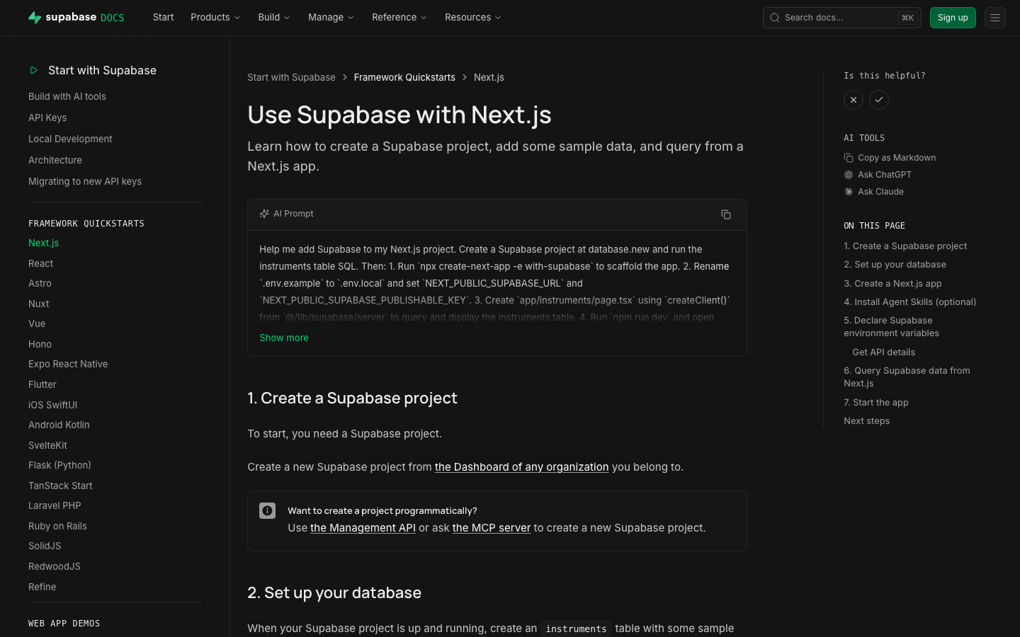 | ### Test plan - [x] Preview renders AI Prompt panel with copy - [x] Spot-check Next.js, Flutter, Expo, Vue - [x] `test-quickstart-prompts` structural - [x] Markdown export includes **AI Prompt** without quote leak - [x] Format CI green after prettier/single-quote decode fix ## Additional context - Worktree: `~/GitHub/supabase/supabase-worktrees/nikrichers/docs-1144-add-ai-prompt-blocks-to-all-18-framework-quickstarts` - Skills: `generate-quickstart-prompts` / `test-quickstart-prompts`; librarian update https://github.com/supabase/docs-agent-skills/pull/21 - `PromptPanel` replaced the older GlassPanel experiment for the expandable copy UI --------- Co-authored-by: Nik Richers <nik@validmind.ai> Co-authored-by: jeremenichelli <jeremenichelli@users.noreply.github.com> |
||
|
Nik Richers
|
e0ecaadc21 |
docs: make AI tools section agent-first (#48167)
## I have read the [CONTRIBUTING.md](https://github.com/supabase/supabase/blob/master/CONTRIBUTING.md) file. YES ## What kind of change does this PR introduce? This PR reworks the `/guides/ai-tools` docs section to be agent-first. The overview now leads with the fastest path to a working setup (the plugin install command), a "What's supported?" card grid showing which coding agents and IDEs work via Plugin and/or MCP (with each product's own tagline, not a generated sentence), and a concepts glossary — instead of a plain four-item list. The sidebar "AI Tools" widget, shown on every guides page, now links to this hub ("Connect your AI agent") instead of opening a ChatGPT/Claude chat frontend. Closes DOCS-1201. ## What is the current behavior? - The `/guides/ai-tools` overview is a plain four-item bullet list with no getting-started path, compatibility info, or concepts explanation. - The sidebar "AI Tools" widget offers "Copy as Markdown", "Ask ChatGPT", and "Ask Claude" — the latter two send you to a chat frontend instead of agent setup. ## What is the new behavior? - `ai-tools.mdx`: intro → plugin install callout → "What's supported?" card grid (`<ContentListings id="ai-tools-supported-agents" />`, icon + tagline + Plugin/MCP badge per agent) → "Key concepts" glossary → "Building AI into your app?" (also converted to `ContentListings`). - New `data/content-listings/ai-tools.data.ts` builds the card grid from the existing `PLUGIN_CLIENTS`/`MCP_CLIENT_DATA` client lists (no new hand-maintained data) — fixing two latent bugs found along the way: GitHub Copilot was keyed differently between the two sources (would have produced duplicate cards), and Windsurf has no upstream docs URL (would have been silently dropped). - New opt-in `badgePosition` field on `ContentListingItem` so the badge renders under the title for the agent grid, without changing the one other existing badge usage (self-hosting's "Official" tag, still inline). - `plugins.mdx`/`mcp.mdx`/`ai-skills.mdx` each get a one-line "Quick start" lead-in so they stand alone via the `.md` content-negotiation route. - `GuidesSidebar.tsx` + `telemetry-constants.ts`: Added "Connect your AI agent" → `/guides/ai-tools`, and the `ask_ai_clicked` event with `agent_setup_clicked`. - Accessibility fix (from review): the "Not supported" indicator now exposes an `sr-only` label instead of being fully `aria-hidden`. ## Additional context - Worktree: `~/GitHub/supabase/supabase-worktrees/nikrichers/docs-1201-make-guidesai-tools-agent-first-and-replace-chat-frontend` - **Open question — Windsurf card**: `windsurf.com` now redirects to a Devin Desktop page (Cognition acquired Windsurf in 2025), but Supabase's own `MCP_CLIENT_DATA` still targets Windsurf's distinct config path (`~/.codeium/windsurf/mcp_config.json`), so the card is still labeled "Windsurf" with its pre-acquisition tagline ("The first agentic IDE. Tomorrow's editor, today."). Needs a follow-up decision on whether to relabel/merge/drop this card once Devin Desktop's MCP support (if any) is confirmed. - Follow-up (not in this PR): deeper IA rework of the ai-tools section belongs to the broader agent-first audit; `content/guides/resources/glossary.mdx` has no MCP/Agent Skills/Plugin/Prompts entries yet — this PR's "Key concepts" is currently the only definition of these terms site-wide. - Verification: | Check | Result | | --- | --- | | Lint (`lint:mdx`, `eslint`), `typecheck`, `test:local lib/content-listings.test.ts` | Pass — 13/13 tests, 0 errors | | `build:guides-markdown` | Pass — card grid flattens cleanly to markdown | | Playwright: broken icon requests, light + dark theme, PR preview | Pass — 0 in either theme | | `/guides/self-hosting` "Official" badge (existing `ContentListings` usage) | Pass — unaffected by the new `badgePosition` opt-in | ### Before & After #### [`/guides/ai-tools`](https://supabase.com/docs/guides/ai-tools) Also shows the sidebar change (right rail): "Ask ChatGPT" / "Ask Claude" → "Connect your AI agent". | [Before](https://supabase.com/docs/guides/ai-tools) | [After](https://docs-git-nikrichers-docs-1201-make-guidesai-too-7c7493-supabase.vercel.app/docs/guides/ai-tools) | | --- | --- | | 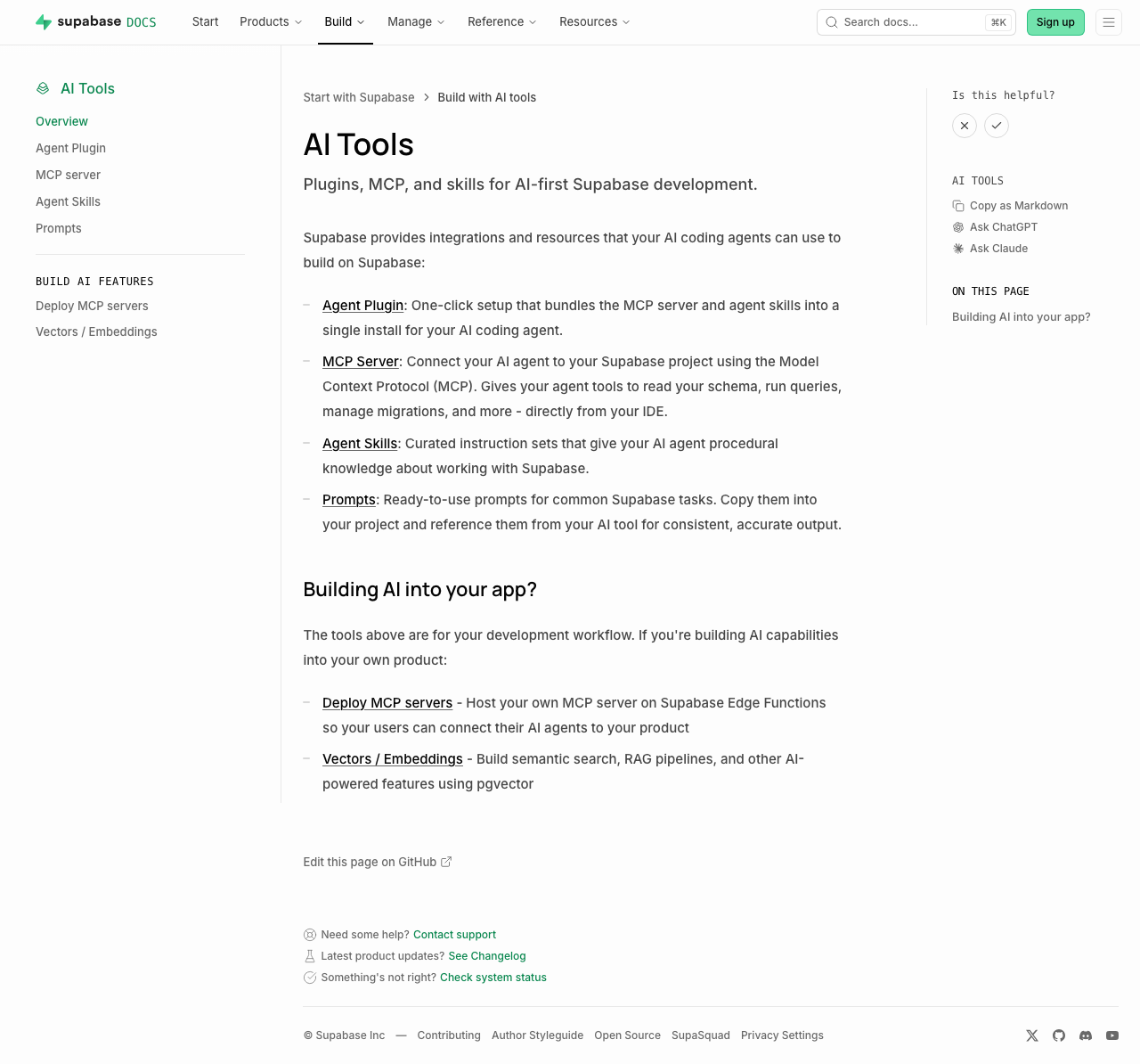 | 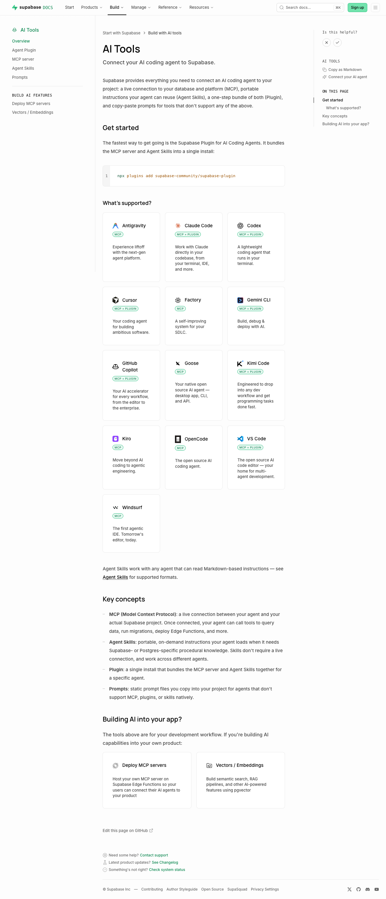 | Sub-pages each just add a one-line "Quick start" callout under the intro (no other layout change): [plugins](https://supabase.com/docs/guides/ai-tools/plugins) ([preview](https://docs-git-nikrichers-docs-1201-make-guidesai-too-7c7493-supabase.vercel.app/docs/guides/ai-tools/plugins)) · [mcp](https://supabase.com/docs/guides/ai-tools/mcp) ([preview](https://docs-git-nikrichers-docs-1201-make-guidesai-too-7c7493-supabase.vercel.app/docs/guides/ai-tools/mcp)) · [ai-skills](https://supabase.com/docs/guides/ai-tools/ai-skills) ([preview](https://docs-git-nikrichers-docs-1201-make-guidesai-too-7c7493-supabase.vercel.app/docs/guides/ai-tools/ai-skills)). ### Test plan - [x] `/guides/ai-tools` renders callout → card grid → concepts → Building AI into your app, in order - [x] Card grid: one card per agent (no duplicate Copilot), Windsurf present, icons clean in both themes, taglines shown, badges below title - [x] Sidebar shows "Connect your AI agent"; self-hosting's "Official" badge unaffected - [x] `.md` route still serves clean markdown; no lingering `ask_ai_clicked`, ChatGPT/Claude icon, or `SupportedAgentsTable` references --------- Co-authored-by: Nik Richers <nik@validmind.ai> |
||
|
Danny White
|
3bca21b3f8 |
chore(a11y): convert leftover focus recipes to focus-ring (#48219)
## What kind of change does this PR introduce? Accessibility cleanup (DEPR-628). ## What is the current behavior? Leftover call sites still use ad-hoc focus recipes (`ring-foreground-muted`, `outline-brand`, Dialog/Sheet `focus:` rings, etc.) instead of the shared utilities from #41575. ## What is the new behavior? Converts those leftovers across `packages/ui`, Studio, www, docs, and design-system to `focus-ring`, preferring `focus-visible`. Keeps documented exceptions (`group-focus-visible`, InputGroup `:has()`). ## To test Tab through controls (keyboard only). Expect a consistent offset ring on `:focus-visible`, not a green/brand/custom stack, and no ring animation. ### www (marketing) Preview: https://zone-www-dot-com-git-danny-depr-628-focus-ring-fbccf9-supabase.vercel.app - Global nav on `/`: Product, Developers, Solutions dropdowns; logo; hamburger + mobile menu - `/features`: view toggles and feature cards - `/company`: card links - `/changelog`: timeline / entry links - `/partners/catalog`: grid/list toggle and partner cards - `/pricing`: compute section expand control - Product / Modules / Solutions sticky navs on product pages (e.g. `/database`, `/storage`) - `/state-of-startups`: TwoOptionToggle if present ### docs Preview: https://docs-git-danny-depr-628-focus-ring-long-tail-supabase.vercel.app - Any guide page: top nav dropdowns and items - Narrow viewport: hamburger, then mobile menu links + close - Guide with PromptPanel / tabs: tab to prompt actions and tab list ### studio (dashboard) Preview: https://studio-staging-git-danny-depr-628-focus-ring-long-tail-supabase.vercel.app - Project home: Connect section tiles; drag-handle focus on sortable sections - Integrations marketplace (`/project/<ref>/integrations`): featured cards, list/grid toggle, list rows - Auth (`/project/<ref>/auth/oauth-apps`, `/project/<ref>/auth/providers`): open create/edit sheet, tab to close (X) - Database policies (`/project/<ref>/database/policies`): open policy editor sheet, tab to close - Storage policies (`/project/<ref>/storage/files/policies`): bucket section links; policy modal close - Query performance (`/project/<ref>/observability/query-performance`): info icon buttons on metrics - Replication pipeline detail (if available): slot lag / status info icons - Support (`/support/new`): attachment add/remove controls - Table editor: spreadsheet import preview checkboxes; row text/JSON editor TwoOptionToggle - Any Dialog/Sheet/toast close (X): ring on keyboard focus only, not mouse click ### design-system Preview: https://design-system-git-danny-depr-628-focus-ring-long-tail-supabase.vercel.app - Colour palette swatches (keyboard focus) - Form patterns sidepanel example: avatar / focusable control in the example ## Additional context - Linear: [DEPR-628](https://linear.app/supabase/issue/DEPR-628) - Follow-ups: form-group CSS (DEPR-629), Storage columns selection (DEPR-630), ESLint rule (DEPR-632) <!-- This is an auto-generated comment: release notes by coderabbit.ai --> ## Summary by CodeRabbit * **Accessibility & Usability** * Standardized keyboard focus indicators across navigation, dialogs, forms, buttons, toggles, links, and tooltips using a consolidated focus style. * Improved toggle controls to use proper button semantics (instead of clickable text), including `aria-pressed`/disabled handling and better keyboard navigation. * **Visual Updates** * Harmonized hover/focus ring visuals across the design system, Studio, documentation, and marketing pages while preserving existing layout and interaction behavior. <!-- end of auto-generated comment: release notes by coderabbit.ai --> |
||
|
Danny White
|
6f6badae51 |
fix(eslint): promote require-explicit-tabindex to error (#48170)
## What kind of change does this PR introduce? Accessibility / lint hardening (Safari keyboard focus). ## What is the current behavior? `supabase/require-explicit-tabindex` is `'warn'`. Studio’s ratchet was at 0 but the rule was still ratcheted; www / docs / design-system still had raw `<button>` / `role="button"` call sites without an explicit `tabIndex`. [DEPR-627](https://linear.app/supabase/issue/DEPR-627) · follow-up to #47984 / #48040 ## What is the new behavior? - Shared config: `'supabase/require-explicit-tabindex': 'error'` - Swept www / docs / design-system (+ Studio test fixtures the ratchet skipped) - Removed the rule from the Studio ratchet + baselines ## To test Prefer **Safari**. This PR only adds explicit `tabIndex` to raw `<button>` / `role="button"` call sites — not links, and not controls that already go through `Button` from `ui`. ### Marketing (`www`) ([staging link](https://zone-www-dot-com-git-danny-depr-627-promote-req-7ae43c-supabase.vercel.app/)) - [x] Homepage frameworks / dashboard feature tabs — Tab through each tab button - [x] Product pages (e.g. `/auth`, `/database`) — section tab switchers - [x] Narrow viewport — open the hamburger; Tab through menu buttons - [x] `/partners/catalog` — filter / view controls - [x] Blog view toggle (list ↔ grid) ### Docs ([staging link](https://docs-git-danny-depr-627-promote-require-explici-25e46d-supabase.vercel.app/)) - [x] **Desktop (≥ lg):** top-right **⋯ menu** (hamburger icon) — opens a dropdown that includes Theme. Not a separate theme button. - [x] **Mobile (< lg):** top-right **hamburger** opens the sheet; close (X) is the raw button we tagged. Theme inside the sheet uses `ThemeToggle` / `DropdownMenuTrigger` from `ui` (already supposed to set `tabIndex`). - [x] **Code blocks** — copy / language controls - [x] **Is this helpful?** — X / check are `Button` from `ui` (should already Tab). After voting **while signed in**, the follow-up “What went well?” / “How can we improve?” text button is the raw one we tagged. - [x] **AI Tools → Copy as Markdown** (right rail on a guide) — this is the only GuidesSidebar control this PR changed. “On this page” TOC items are **links**, not covered by this lint. - [x] **Reference docs** (e.g. JS client reference) — section headers that expand/collapse in the left nav (`Collapsible.Trigger`) - [x] **Troubleshooting index** — type in the search field, then Tab to the **clear (X)** control ### Dashboard (`studio`) No production UI changes in this PR (tests + lint config only). Quick Safari smoke that prior tabindex work still holds: - [x] Project sidebar — Tab through primary nav links - [x] Settings → General — Tab through inputs / buttons - [x] Storage → Files — Tab a bucket row / file actions |
||
|
Saxon Fletcher
|
2d745edfb4 | Landing page agent focus (#47989) | ||
|
Pedro Rodrigues
|
ceb4110568 |
docs: add VS Code to the AI coding agent plugin install picker (#48108)
Adds VS Code to the AI coding agent plugins docs, as VS Code now [supports plugins](https://code.visualstudio.com/docs/agent-customization/agent-plugins) <img width="763" height="396" alt="image" src="https://github.com/user-attachments/assets/7520a83c-5652-44b4-9136-013f3da5f45b" /> ### Steps to reproduce it 1. Navigate to https://docs-git-add-vs-code-plugins-support-to-docs-supabase.vercel.app/docs/guides/ai-tools/plugins#manual-install 2. Select "VS Code" in the `Client` dropdown <!-- This is an auto-generated comment: release notes by coderabbit.ai --> ## Summary by CodeRabbit * **New Features** * Added Visual Studio Code to the supported plugin integrations. * Added VS Code installation guidance, including the plugin repository and manifest specification links. <!-- end of auto-generated comment: release notes by coderabbit.ai --> |
||
|
Pedro Rodrigues
|
45ba40eff9 |
docs: add Kimi Code to MCP and AI coding agent plugin setup (#48099)
Adds Kimi Code to the MCP server setup and AI coding agent plugins docs: ### MCP Server config <img width="755" height="703" alt="image" src="https://github.com/user-attachments/assets/b350aca0-ff0d-442b-b6f3-b3b4355d8fcd" /> ### AI coding agent plugins <img width="753" height="475" alt="image" src="https://github.com/user-attachments/assets/100d5893-4627-4f48-9ab6-16e0c6457467" /> Closes AI-933 <!-- This is an auto-generated comment: release notes by coderabbit.ai --> ## Summary by CodeRabbit * **New Features** * Added **Kimi Code** as a selectable plugin client in the plugins panel. * Added **Kimi-specific installation/setup instructions**, including guidance on placing `mcp.json`, confirming the trust prompt, and using `/plugins` plus `/mcp` and `/mcp-config`. * Extended the **MCP URL builder** to generate Kimi Code HTTP-based server configuration. * Included **Kimi** in the **IDE** client group with a dedicated **Kimi icon** for UI display. <!-- end of auto-generated comment: release notes by coderabbit.ai --> --------- Co-authored-by: Claude Opus 4.8 (1M context) <noreply@anthropic.com> |
||
|
Gildas Garcia
|
26b1fd9aab |
fix: keyboard navigation between docs tabs (#47778)
## Problem Keyboard navigation on docs tabs is confusing: - tab panels can be focused but without any indication that they are - code example buttons can be focused with keyboard but stay invisible - copy code button has no label and do not notify screen reader users about its status ## Solution - Make tab panels non focusable - Ensure buttons are visible when focused - Add a label to the copy code buttons - Add a live region for the copy code status ## How to test 1. Go to https://docs-git-gildasgarcia-docs-1156-cannot-keyboard-140a35-supabase.vercel.app/docs/guides/local-development/cli/getting-started 2. Go to a tab list with _Tab_ key 3. Verify you can choose the tab value with Arrow keys and select it with space 4. Tab again and verify you now have focused the code example first button and it is visible 5. Tab again and the copy code button should be focused and visible If you enable Voice over, clicking the copy code button should announce that the code has been copied <!-- This is an auto-generated comment: release notes by coderabbit.ai --> ## Summary by CodeRabbit ## Summary by CodeRabbit * **Bug Fixes** * Improved code block copy feedback so the “copied” state resets more reliably after interaction. * **Accessibility Improvements** * Code block controls now appear on keyboard focus (not just hover) and include an assistive live announcement when copying succeeds. * Enhanced code block semantics with clearer ARIA labeling. * Prevented tab panels from being reachable through normal tab navigation to reduce unintended focus stops. <!-- end of auto-generated comment: release notes by coderabbit.ai --> |
||
|
Francesco Sansalvadore
|
9b05afa2a3 |
Fix(docs): guides subheadings (#47765)
Fix docs subheading by removing the h2 html tag and adjusting styling. Likely a result of a merge conflict resolution between #47441 and #47288 ## What is the current behavior? <img width="1168" height="641" alt="Screenshot 2026-07-09 at 10 19 00" src="https://github.com/user-attachments/assets/c23b2e88-650c-4835-ae10-5a13c7b2e180" /> ## What is the new behavior? <img width="1167" height="605" alt="Screenshot 2026-07-09 at 10 32 56" src="https://github.com/user-attachments/assets/852f208c-2b22-4bf6-ad8c-edcf5bee5991" /> <!-- This is an auto-generated comment: release notes by coderabbit.ai --> ## Summary by CodeRabbit * **Style** * Refined how guide subtitles are displayed for a cleaner, more consistent layout. * Adjusted subtitle spacing and presentation while keeping subtitle content rendering with formatted text support intact. <!-- end of auto-generated comment: release notes by coderabbit.ai --> |
||
|
Saxon Fletcher
|
19ee79b030 |
color text refine (#47718)
Adjusts light theme for better contrast on foreground, muted-foreground and tertiary-foreground text <!-- This is an auto-generated comment: release notes by coderabbit.ai --> ## Summary by CodeRabbit * **Style** * Retuned the light theme’s surface chroma and updated light, muted, and tertiary foreground levels for improved readability. * Updated the brand link color saturation to better align with the revised theme. * Refreshed code block token colors for both light and dark themes. * **Documentation** * Updated the “Edit this page on GitHub” link styling to use updated token-based text colors for default and hover states. <!-- end of auto-generated comment: release notes by coderabbit.ai --> |
||
|
Jeremias Menichelli
|
689b6991f0 | fix: Remove always-open Accordion behavior (#47638) | ||
|
Saxon Fletcher
|
0ae4f32ad9 |
docs: kaizen fixes to QuickStarts (#47481)
https://github.com/user-attachments/assets/fba86c42-a122-4eb5-8531-db663d022100 Makes a few style and content changes focused on our quickstarts, starting with - docs/guides/getting-started/quickstarts/reactjs - docs/guides/getting-started/quickstarts/nextjs. Changes - Reduced container size and increased x padding for more breathing room - Adjusted header padding and spacing - Stripped non critical content from guides - Merged steps where possible e.g. one sql blocks to run instead of multiple - Moved shadcn/supabase ui components into a next step - Introduced a step for installing agent skills (in future can be plugin) <!-- This is an auto-generated comment: release notes by coderabbit.ai --> ## Summary by CodeRabbit * **Documentation** * Updated multiple quickstarts to add an **“Open Connect panel”** primary action for environment-variable setup. * Removed extra UI CTA partials from several “Query” sections. * Added **Next steps** links to drop-in UI components and extended the database flow with an optional **agent skills** step. * **UI / Guide Layout** * Refreshed guide spacing/typography (breadcrumb spacing, header margins, and removed subtitle divider). * Adjusted guide/table-of-contents sizing and tightened step/details and code section alignment. * Updated main layout width and padding for docs pages. <!-- end of auto-generated comment: release notes by coderabbit.ai --> --------- Co-authored-by: Chris Chinchilla <chris.ward@supabase.io> Co-authored-by: github-actions[bot] <41898282+github-actions[bot]@users.noreply.github.com> |
||
|
Chris Chinchilla
|
30b02aa0b7 |
docs: Allow for custom MCP server URLs (#47218)
## I have read the [CONTRIBUTING.md](https://github.com/supabase/supabase/blob/master/CONTRIBUTING.md) file. YES <!-- This is an auto-generated comment: release notes by coderabbit.ai --> ## Summary by CodeRabbit * **New Features** * Added new public MCP base URL environment variables for hosted and self-hosted setups. * Introduced reusable MDX components to render custom MCP configuration content. * **Documentation** * Updated the MCP guide to reference shared MCP server template values for examples. * Swapped the CI configuration example for a component-rendered snippet for consistency. * **Bug Fixes** * Improved self-hosted MCP base URL fallback so it prefers the new non-platform URL when no custom API URL is provided. <!-- end of auto-generated comment: release notes by coderabbit.ai --> --------- Co-authored-by: Copilot Autofix powered by AI <175728472+Copilot@users.noreply.github.com> |
||
|
Gildas Garcia
|
4b7cb27ba9 |
chore: refactor docs tabs (#47557)
## Problem Now that `docs` is the only place where we use the deprecated `ui/Tabs`, we can move this component and the related HOC from `ui-patterns` in `docs` ## Solution - Move `ui/Tabs`, `ui-patterns/ComplexTabs/withQueryParams` and `ui-patterns/ComplexTabs/withSticky` to `docs` - Refactor `ui-patterns/ComplexTabs/withQueryParams` and `ui-patterns/ComplexTabs/withSticky` HOCs as hooks to make them easier to understand - Refactor `Tabs` accordingly No visual nor functional changes. ## How to test On https://docs-git-chore-refactor-docs-tabs-supabase.vercel.app/docs/guides/auth/passwords (Tabs are driven by URL and the flow tabs should have sticky headers even though there's a CSS bug already reported) - check that by default, the first tab in each tabs is active - change the tabs in different groups and validate it works - refresh the page and check that previously selected tabs are active (URL based selection) - In a new tab, visit https://docs-git-chore-refactor-docs-tabs-supabase.vercel.app/docs/guides/auth/passwords again and check that previously selected tabs are active (LocalStorage based selection) Do the same on https://docs-git-chore-refactor-docs-tabs-supabase.vercel.app/docs/guides/database/database-advisors (This one is driven by URL but does not have sticky tab headers) Do the same on https://docs-git-chore-refactor-docs-tabs-supabase.vercel.app/docs/guides/deployment/terraform/reference (this one is not driven by URL nor has sticky tab headers) <!-- This is an auto-generated comment: release notes by coderabbit.ai --> ## Summary by CodeRabbit * **New Features** * Docs tabs now persist and restore the active tab via URL query parameters. * Added optional “sticky” tab behavior that keeps the active panel in view. * Enhanced keyboard interaction for selecting tabs. * **Bug Fixes** * Improved active-tab initialization and synchronization when the URL query changes. * **Chores** * Refreshed the tabs UI implementation and styling to improve consistency and remove deprecated tab exports from shared UI packages. <!-- end of auto-generated comment: release notes by coderabbit.ai --> |
||
|
Francesco Sansalvadore
|
acbb19a69a |
feat: www & docs fonts (#47227)
Update marketing website and docs with new sans-serif fonts: - `Inter` - sans-serif for all body text - `Manrope` - sans-serif for headings PR breakdown of #43455 Related: #47226 #47228 #47236 |
||
|
Gildas Garcia
|
b30db91d71 |
chore: cleanup UI patterns exports (#47406)
## Problem We now export components under a subpath in ui-patterns to avoid barrel files as they slow down every tools (from IDE to linters, etc.) and may also affect bundles our users have to download. ## Solution - Remove the UI patterns index file - Fix invalid impors |
||
|
Jeremias Menichelli
|
9de5b16909 | chore: Refactor ErrorCodes component and data. Offer markdown alternative (#47189) | ||
|
Gildas Garcia
|
96d43099bb |
chore: refactor Button API so that it can be used a standard button (#46880)
## Problem Our `<Button>` component breaks the default `button` contract by redefining the `type` prop to set its variant (`primary`, `default`, etc) instead of the button type (`submit`, `button`, etc). This is confusing and forces to write more code when using it with shadcn components that expect/inject the standard button props. ## Solution - rename the `type` prop to `variant` - rename the `htmlType` prop to `type` - propagate the changes where necessary - format code ## How to test As this is just prop renaming, if it builds it's ok --------- Co-authored-by: Ivan Vasilov <vasilov.ivan@gmail.com> |
||
|
Pedro Rodrigues
|
bf26acaa32 |
fix(docs): update Gemini CLI extension repo URL (#46736)
## Summary Update Gemini CLI Extension repo URL from https://github.com/supabase-community/gemini-extension to https://github.com/supabase-community/supabase-plugin. Closes [AI-807](https://linear.app/supabase/issue/AI-807/update-gemini-cli-installation-command-with-the-new-github-repo-in-our) <!-- This is an auto-generated comment: release notes by coderabbit.ai --> ## Summary by CodeRabbit * **Documentation** * Updated Gemini CLI plugin configuration to reference the Supabase community plugin repository * Updated installation instructions and repository links to reflect the new plugin location <!-- end of auto-generated comment: release notes by coderabbit.ai --> Co-authored-by: Claude Sonnet 4.6 <noreply@anthropic.com> |
||
|
Pedro Rodrigues
|
bc8bde37b6 |
docs: add GitHub Copilot plugin install instructions (#46232)
## Summary - Adds GitHub Copilot as an option in the `AgentPluginsPanel` component - Shows install instructions via Github repo (`copilot plugin install supabase-community/supabase-plugin`) <img width="1919" height="926" alt="image" src="https://github.com/user-attachments/assets/0bbb758a-ba78-425b-8925-64d7c4d9cc39" /> ## Notes - Marketplace install omitted for now — we only show the direct GitHub repo install until we confirm the [official marketplace](https://github.com/github/copilot-plugins) listing name - [PR](https://github.com/github/copilot-plugins/pull/40) to add Supabase Copliot plugin to the official plugin marketplace Closes [AI-773](https://linear.app/supabase/issue/AI-773/add-github-copilot-plugin-install-instructions-to-docs) <!-- This is an auto-generated comment: release notes by coderabbit.ai --> ## Summary by CodeRabbit ## Release Notes * **New Features** * Added GitHub Copilot plugin support with installation instructions, allowing users to integrate the plugin into their workflow. <!-- review_stack_entry_start --> [](https://app.coderabbit.ai/change-stack/supabase/supabase/pull/46232?utm_source=github_walkthrough&utm_medium=github&utm_campaign=change_stack) <!-- review_stack_entry_end --> <!-- end of auto-generated comment: release notes by coderabbit.ai --> --------- Co-authored-by: Claude Sonnet 4.6 <noreply@anthropic.com> |
||
|
Gildas Garcia
|
243e079a2c |
chore: remove _Shadcn_ suffix from Command components (#46153)
## Problem The `_Shadcn_` suffix isn't needed anymore on `Command` components ## Solution - Remove the `_Shadcn_` suffix - Simplify UI package exports - Apply prettier <!-- This is an auto-generated comment: release notes by coderabbit.ai --> ## Summary by CodeRabbit * **Refactor** * Simplified command component imports and exports across the UI library by removing internal naming aliases and adopting direct component references. Updated the public UI package barrel export to use wildcard re-exports for cleaner API surface. <!-- review_stack_entry_start --> [](https://app.coderabbit.ai/change-stack/supabase/supabase/pull/46153?utm_source=github_walkthrough&utm_medium=github&utm_campaign=change_stack) <!-- review_stack_entry_end --> <!-- end of auto-generated comment: release notes by coderabbit.ai --> |
||
|
Gildas Garcia
|
8577b5fe77 |
chore: remove <Accordion> _Shadcn_ suffix (#46107)
## Problem The `_Shadcn_` suffix isn't needed anymore on Accordion components ## Solution - Remove the `_Shadcn_` suffix - Simplify UI package exports - Apply prettier <!-- This is an auto-generated comment: release notes by coderabbit.ai --> ## Summary by CodeRabbit * **Refactor** * Updated accordion component exports and imports to use unified naming conventions across the codebase, improving consistency for developers using the UI library. <!-- review_stack_entry_start --> [](https://app.coderabbit.ai/change-stack/supabase/supabase/pull/46107?utm_source=github_walkthrough&utm_medium=github&utm_campaign=change_stack) <!-- review_stack_entry_end --> <!-- end of auto-generated comment: release notes by coderabbit.ai --> |
||
|
Gildas Garcia
|
082c2546d2 |
chore: migrate from deprecated Accordion to new shadcn components (#46103)
## Problem We have multiple Accordion components ## Solution Migrate Accordion usages to Shadcn components ## Screenshots ### Documentation MDX pages Before: <img width="1156" height="1088" alt="image" src="https://github.com/user-attachments/assets/0f7b90ec-a613-45cf-8b04-39d2fd4b9644" /> After: <img width="1154" height="952" alt="image" src="https://github.com/user-attachments/assets/05c5051d-fa2a-497a-8f6f-96d555098e33" /> ### Documentation Mobile Menu Before: <img width="389" height="674" alt="image" src="https://github.com/user-attachments/assets/c9a0fa7a-3590-4f10-acfd-8add16c28b7b" /> After: <img width="376" height="665" alt="image" src="https://github.com/user-attachments/assets/d85fe05d-6d71-4e63-b0ea-cdc495d2fa94" /> ### www - Launch week pages Before: <img width="1434" height="718" alt="image" src="https://github.com/user-attachments/assets/d777f887-65d4-49f2-8b12-5b05010ba95d" /> After: <img width="1428" height="732" alt="image" src="https://github.com/user-attachments/assets/4fa7eb02-12c7-4b3b-b77f-09846518690c" /> <!-- This is an auto-generated comment: release notes by coderabbit.ai --> ## Summary by CodeRabbit * **Refactor** * Replaced and standardized accordion UI across docs, navigation, mobile menu, pricing FAQs, Launch Week pages, and error/detail panels for a more consistent, reliable expand/collapse experience. * **Bug Fixes** * Fixed inconsistencies in accordion behavior and item rendering (e.g., multi-open support and disabled states) to improve navigation and content discovery. <!-- review_stack_entry_start --> [](https://app.coderabbit.ai/change-stack/supabase/supabase/pull/46103?utm_source=github_walkthrough&utm_medium=github&utm_campaign=change_stack) <!-- review_stack_entry_end --> <!-- end of auto-generated comment: release notes by coderabbit.ai --> |