mirror of
https://github.com/backnotprop/plannotator.git
synced 2026-09-14 14:17:26 +08:00
 Michael Ramos
ed4f2e82fe
Michael Ramos
ed4f2e82fe
* feat(review): one-time Guided Reviews intro dialog + Guide button hint

New GuideIntroDialog slots into the announcement chain (look-and-feel ->
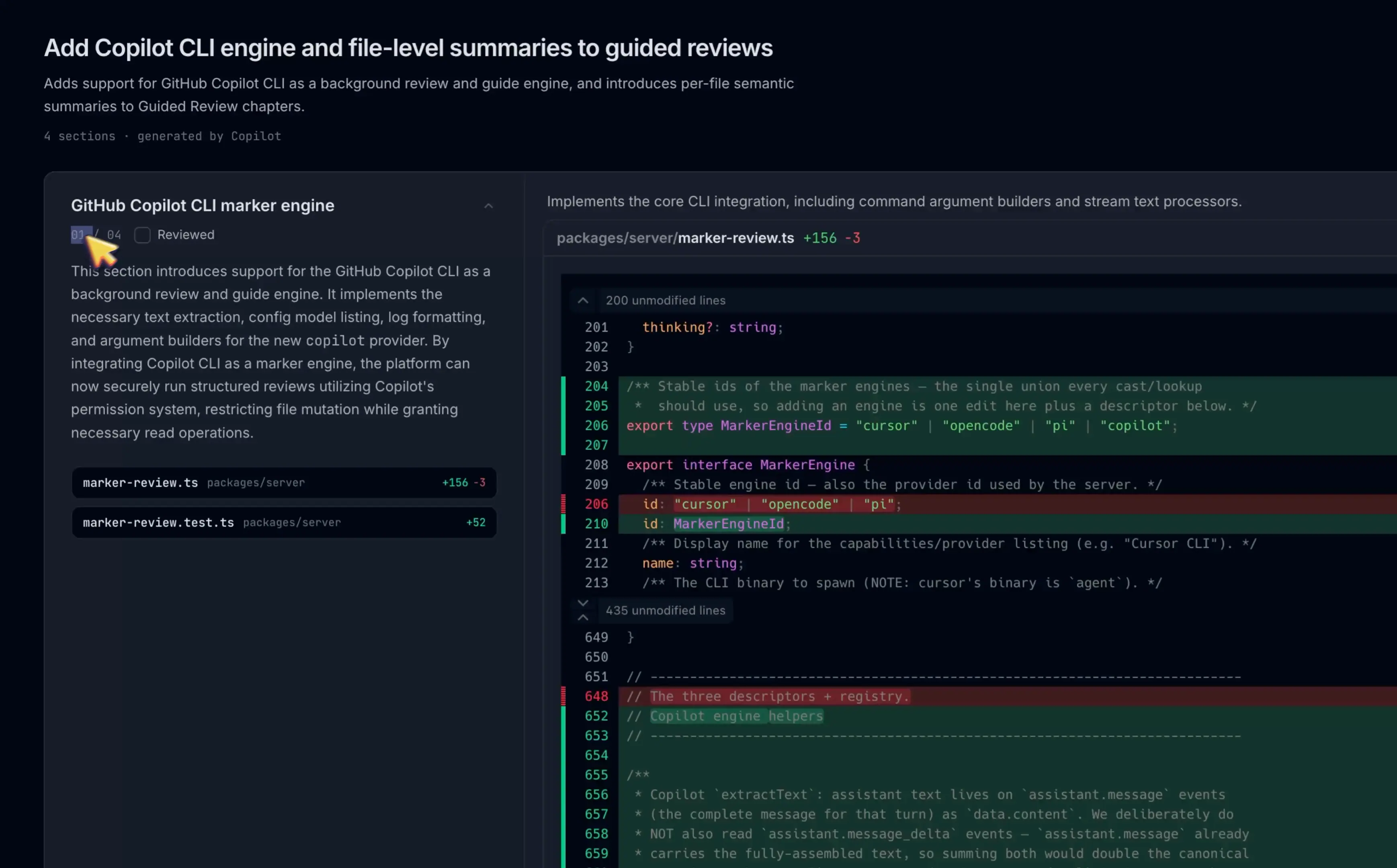
guide intro -> review setup, never stacking): a hero screenshot of a
guided review with a brief plain-language description and a mock header
strip pointing at the real Guide button. Shows once per user (cookie),
and only when a Guide button actually exists (hasSearchableFiles) --
skipping the render does not consume the one-shot cookie.

The hero is CDN-hosted at https://plannotator.ai/assets/guided-review.webp
(committed to apps/marketing/public/assets so every marketing deploy
re-ships it past the --delete sync; uploaded to S3 now so it is already
live) instead of growing the single-file bundle; on load failure the
image container hides entirely for a clean text-only dialog.

Independently of the dialog, the header Guide button shimmers
(TextShimmer) with a pulsing dot until the guide is first opened --
acked on ANY open path (button, shortcut, job auto-open), not just the
button click.

* fix(review): guide intro first in the dialog chain, full-width panel

Chain is now guide intro -> look-and-feel -> review setup (was second);
panel widened to max-w-5xl to match the look-and-feel dialog. Intro seen
flag switched to the versioned-cookie pattern so future revisions can
re-show it.

* fix(review): latch guide-intro eligibility at first post-load render

hasSearchableFiles changes on mid-session diff switches; an
empty-to-non-empty switch would pop the intro over work in progress, or
yank an open look-and-feel dialog (its gate reads guideIntroVisible).
Eligibility is now decided once when loading clears -- dialogs only
mount after that, so the latch is always set before they render. A
skipped session keeps the cookie unconsumed. Also corrects AGENTS.md's
chain order (guide intro first).
78 lines
3.2 KiB
TypeScript
78 lines
3.2 KiB
TypeScript
import React, { useState } from 'react';
|
|
import { createPortal } from 'react-dom';
|
|
import { TextShimmer } from '@plannotator/ui/components/TextShimmer';
|
|
|
|
/**
|
|
* One-time "Introducing Guided Reviews" announcement — same shell as
|
|
* LookAndFeelAnnouncementDialog. The hero image is CDN-hosted (not bundled),
|
|
* so on load failure the image container hides entirely and an offline user
|
|
* gets a clean text-only dialog instead of a broken-image icon.
|
|
*/
|
|
|
|
interface GuideIntroDialogProps {
|
|
isOpen: boolean;
|
|
onDismiss: () => void;
|
|
}
|
|
|
|
const HERO_IMAGE_URL = 'https://plannotator.ai/assets/guided-review.webp';
|
|
|
|
export const GuideIntroDialog: React.FC<GuideIntroDialogProps> = ({ isOpen, onDismiss }) => {
|
|
const [imageFailed, setImageFailed] = useState(false);
|
|
if (!isOpen) return null;
|
|
|
|
return createPortal(
|
|
<div className="fixed inset-0 z-[100] flex items-center justify-center bg-background/90 backdrop-blur-sm p-4">
|
|
{/* max-h clamp + scrollable body: same protection ReviewSetupDialog
|
|
needed — the hero makes this panel taller than short viewports. */}
|
|
<div className="bg-card border border-border rounded-xl w-full max-w-5xl max-h-[calc(100vh-2rem)] shadow-2xl flex flex-col">
|
|
{/* Header */}
|
|
<div className="p-7 border-b border-border">
|
|
<h3 className="font-semibold text-2xl">Introducing Guided Reviews</h3>
|
|
</div>
|
|
|
|
<div className="p-7 flex flex-col gap-5 overflow-y-auto">
|
|
{/* Hero. aspect ratio reserved so the panel doesn't jump on load. */}
|
|
{!imageFailed && (
|
|
<div className="aspect-[3476/2160] w-full">
|
|
<img
|
|
src={HERO_IMAGE_URL}
|
|
alt="Guided review: chaptered changes with per-file summaries"
|
|
className="w-full h-full object-cover rounded-lg border border-border select-none"
|
|
draggable={false}
|
|
onError={() => setImageFailed(true)}
|
|
/>
|
|
</div>
|
|
)}
|
|
|
|
<p className="text-sm text-muted-foreground leading-relaxed">
|
|
A guided review organizes your changeset into ordered chapters, with the most
|
|
important changes first. Every file gets a brief summary of what changed. It is
|
|
generated on demand by your local agent CLI.
|
|
</p>
|
|
|
|
{/* Launch hint: a compact mock of the app header with the Guide pill. */}
|
|
<div className="flex items-center gap-3 rounded-lg border border-border bg-muted/40 px-3 py-2">
|
|
<span className="bg-muted rounded-md text-xs font-medium px-2 py-1 select-none">
|
|
<TextShimmer duration={2.5} spread={1.5}>Guide</TextShimmer>
|
|
</span>
|
|
<span className="text-xs text-muted-foreground">
|
|
Find Guide in the top left of the app header.
|
|
</span>
|
|
</div>
|
|
</div>
|
|
|
|
{/* Footer */}
|
|
<div className="px-7 py-5 border-t border-border flex justify-end">
|
|
<button
|
|
onClick={onDismiss}
|
|
className="px-4 py-2 bg-primary text-primary-foreground rounded-lg text-sm font-medium hover:opacity-90 transition-opacity"
|
|
>
|
|
Got it
|
|
</button>
|
|
</div>
|
|
</div>
|
|
</div>,
|
|
document.body
|
|
);
|
|
};
|